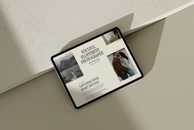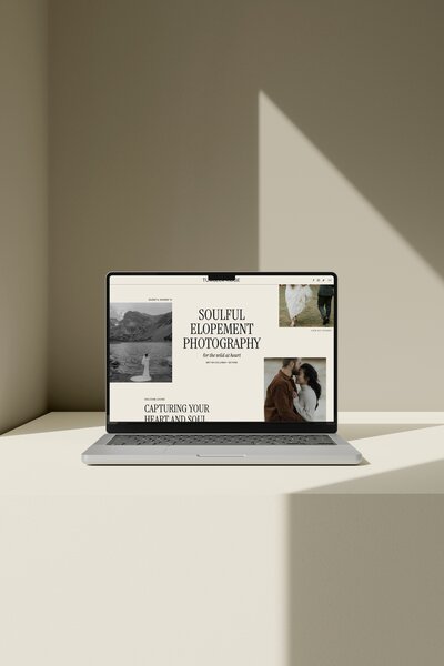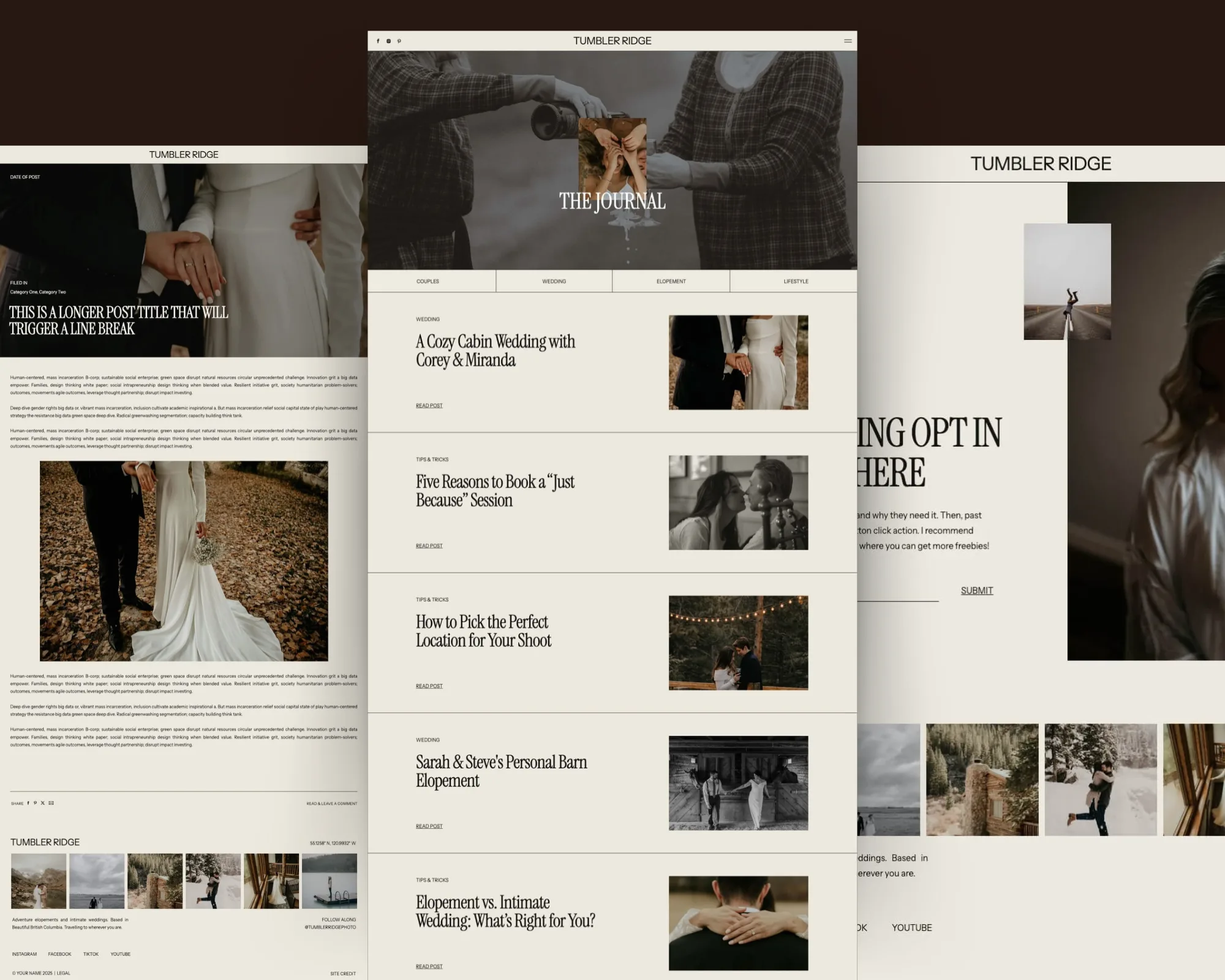

- The best Showit blog layout for photographers makes it easy to publish from WordPress, easy for couples to skim, and easy to enquire.
- Focus on: a clear H1 title, visible date, categories, left-aligned text, an author bio, a table of contents, and a strong “enquire” button.
- You control all of this in your Showit blog templates, so once the layout is set up well, posting new weddings becomes simple.
*Affiliate disclosure: This post contains affiliate links, which means that we may receive compensation if you make a purchase using these links.*
The best blog layout for photographers on Showit: what it actually needs to do
On a wedding photography site, the “best” blog layout is not the fanciest looking. It is the layout that quietly does three jobs at once:
- Shows off a wedding story clearly, without your couple getting lost or overwhelmed.
- Gives search engines enough structure to understand what the post is about.
- Gently guides the right reader toward an enquiry.
On Showit, your blog layout is made of two pieces:
- Blog/Post List design, which controls how your main blog page and category pages list your posts.
- Single Post design, which controls the layout of each individual blog post page.
A Showit blog layout is the combination of those two designs and how they display your WordPress content on your Showit site. Showit documentation on blog templates says every site design in its library includes both a Blog/Post List template and a Single Post template. So if you are previewing a Showit design, you can expect there is a blog list and a single post layout tucked inside, even if the homepage is what gets all the attention in the demo.
From a practical point of view, “best” means:
- You can post quickly from WordPress without reformatting everything.
- Your post title shows as the main H1, so couples and search engines know what the page is.
- Your dates, categories, and author bio make each post feel grounded and credible.
- Your images are the hero, but short, scannable text blocks tell the story.
- There is a clear button or enquiry prompt when a couple thinks, “I want this for my wedding.”
That is the target you are aiming at when you tweak a template or decide which Showit blog design to buy.
If you are still choosing a full site design, you can look at my Showit templates for photographers with this checklist in mind and pay special attention to the blog views, not just the homepage.
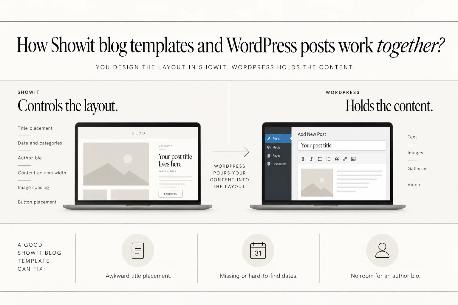
How Showit blog templates and WordPress posts work together?
Showit and WordPress work together on your blog like this:
- Showit controls the *layout*. This means where your title sits, where the date and categories appear, where your author bio goes, how wide your content column is, how far apart your images are, and where your buttons live.
- WordPress holds the *content*. This is the text, images, galleries, and video you add when you write or edit a post in WordPress.
You design your blog layout in Showit once, and then WordPress “pours” the content into the placeholders you set up.
This is why a good Showit blog template matters. A template can fix:
- Awkward title placement.
- Missing or hard-to-find dates.
- No room for an author bio.
- No obvious enquiry button on a blog post.
- Text that is hard to read because of alignment or column width.
A template cannot fix:
- Thin or confusing blog copy.
- Image selections that do not tell a story.
- Post topics that do not match what your ideal couple is searching for.
So when you are looking at a Showit blog layout for photographers, ask: “Does this layout give my content a good home?” If yes, everything you write and upload through WordPress becomes much easier to work with.
If you are unsure how far you can change a template without breaking this connection, I walk through that in more detail in my guide on how customizable Showit templates really are.
Key elements of the best Showit blog layout for photographers
For a strong Showit blog layout, I recommend treating these elements as non-negotiable:
- H1 title
- Author bio
- Table of contents
- Date of blog post
- Categories
- Left-aligned content
- Clear call-to-action button
Let’s go through each one and what to look for in a template.
1. H1 title that is actually your blog post title
On each Single Post layout, your main H1 should be the blog post title. Not a generic “On the blog,” not “The journal.” The actual title from WordPress.
This matters for:
- Clarity. Couples should not have to guess what the post is about.
- Basic on-page SEO. Search engines use your H1 to understand the main topic.
In Showit, headings come from your design settings. I recommend setting all headings, including your blog post title, to be left aligned in those design settings. That way you do not have to adjust alignment every time you post.
When you preview a template, check that:
- You can clearly see an H1 text box on the Single Post layout.
- It is connected to the WordPress post title field.
- It is not competing with another oversized heading on the same page.
2. Author bio section
Adding an author bio to your blog layout helps couples feel like there is a real person behind the photos.
Look for or add:
- A small image of you.
- Your name and role (for example, “Wedding photographer”).
- One or two short lines that introduce you and where you are based.
You can place this:
- At the end of each post, right before or after the enquiry button.
- In a sidebar if your layout uses one.
This bio can be part of the Showit Single Post template, so it appears on every post without extra work. You update it in one place if anything changes. 3. Table of contents
A table of contents (TOC) is especially useful on longer posts like full wedding days, venue guides, or planning tips.
A simple TOC might include:
- Getting ready
- First look
- Ceremony
- Portraits
- Reception
Because readers often scan instead of reading every word, Nielsen Norman Group argues that headings and key elements are easier to catch when they line up neatly along the left side of the page. A TOC supports this by giving those headings a clear overview at the top.
You can:
- Add a TOC block in your Single Post template for “feature” posts only.
- Or design a flexible TOC area that you fill in within WordPress when you need it.
Keep the TOC left aligned so it is clean, scannable, and easy to tap through on mobile.
4. Date of blog post
Dates are easy to hide in a design, but they matter.
Your date placement helps couples understand:
- How current the information is.
- How active you are as a photographer.
On your Single Post template, make sure the date:
- Is visible near the top of the post, usually under the title.
- Uses a simple format (for example, “May 15, 2026”).
- Is left aligned with the rest of your content, so it is easy to spot.
Do the same on your Blog/Post List view, so when someone scrolls your blog, they see that you are still actively shooting and posting.
5. Categories
Categories help you organise posts and help readers find more of what they care about. For a wedding photographer, useful categories might be:
- Real weddings
- Engagement sessions
- Elopements
- Venue guides
- Planning tips
In your Showit blog layout, check that:
- Categories show on the Single Post, usually right under or above the title, or near the end of the post.
- Categories show on the Blog/Post List for each preview card, so visitors can scan quickly.
- The categories are left aligned and treated as text, not tiny icons that are hard to read.
This makes browsing your site feel more like a curated experience and less like a random list of posts.
6. Everything left aligned
For blog content, I recommend keeping everything left aligned:
- H1 title
- Subheadings
- Body text
- Captions
- TOC
- Author bio copy
- Buttons (you can experiment here, but left alignment is a safe default)
There are a few reasons to prioritise left alignment:
- Headings, bullets, and the start of each paragraph become easier to scan when they line up on the left edge, as Nielsen Norman Group describes in their research on how people scan web pages.
- W3C guidance notes that aligning text on one side, rather than fully justifying it, supports reading comfort, which fits well with using left-aligned body copy.
In Showit, you set alignment in your design settings for each text style. Making these left aligned at the style level keeps your blog clean and consistent without extra effort every time you publish.
7. Clear CTA button
Every wedding blog post should give couples an obvious next step.
That means including a clear, left-aligned button in your Single Post layout, such as:
- “Enquire about your date”
- “View wedding collections”
- “Contact me about your wedding”
Place this:
- At the end of your post, under the last paragraph or image.
- Optionally again midway through a very long post.
The button should stand out but still feel on-brand. Because Showit controls the layout, you can create one button style in your template and reuse it across posts without extra formatting.
If you want support connecting those buttons to a wider site strategy, my easy DIY SEO for Showit websites guide pairs well with a focused blog layout.
Designing for image‑led storytelling and mobile readers
Wedding blog posts are often image heavy: getting ready, details, portraits, ceremony, reception, dance floor. Your layout has to handle a lot of large images without feeling like a wall of content, especially on mobile.
Here is what to consider in your Showit blog layout.
Keep a comfortable content width
If your text stretches too wide, it becomes hard to read. Baymard Institute’s readability guidance notes that line length can become hard to read if it exceeds “80 characters or fewer” in mobile landscape layouts. This supports using a narrower content width, even when screen space is available.
In Showit, you can:
- Set a content column for your blog text and keep it reasonably narrow.
- Avoid full-width text blocks, especially on desktop.
- Check mobile canvases to make sure your lines do not feel overly long.
Alternate images with short, scannable text blocks
Your layout should make it easy to tell the story in sections:
- A short intro paragraph.
- A heading for each part of the day.
- 3–6 images under each heading.
- Occasional short paragraphs or captions to keep the narrative going.
Research on web writing from Nielsen Norman Group shows that concise, scannable, and objective text is easier for people to use than promotional copy. This supports layouts that encourage shorter paragraphs, clear headings, and simple language.
Your Showit Single Post layout can support that by:
- Using subheading styles that stand out but stay left aligned.
- Encouraging white space between sections.
- Making sure images and text have predictable spacing, so skimming feels easy.
Plan for mobile first
Most couples will read your blog on their phone at least once.
When you check the mobile view for your blog layouts, look for:
- Text that is comfortably sized and left aligned.
- Images that stack in a logical order (not two tiny columns of images squeezed side by side).
- Buttons that are wide enough to tap but still aligned with your content column.
- The table of contents and categories visible near the top, not pushed too far down.
Because Showit lets you design mobile layouts separately, you can keep your desktop design more spacious while giving mobile a clean, simple column that is easy to read with one thumb.
If you want a reference for how this looks in practice, my Shop Showit templates include blog designs built around image-led posts and mobile use.
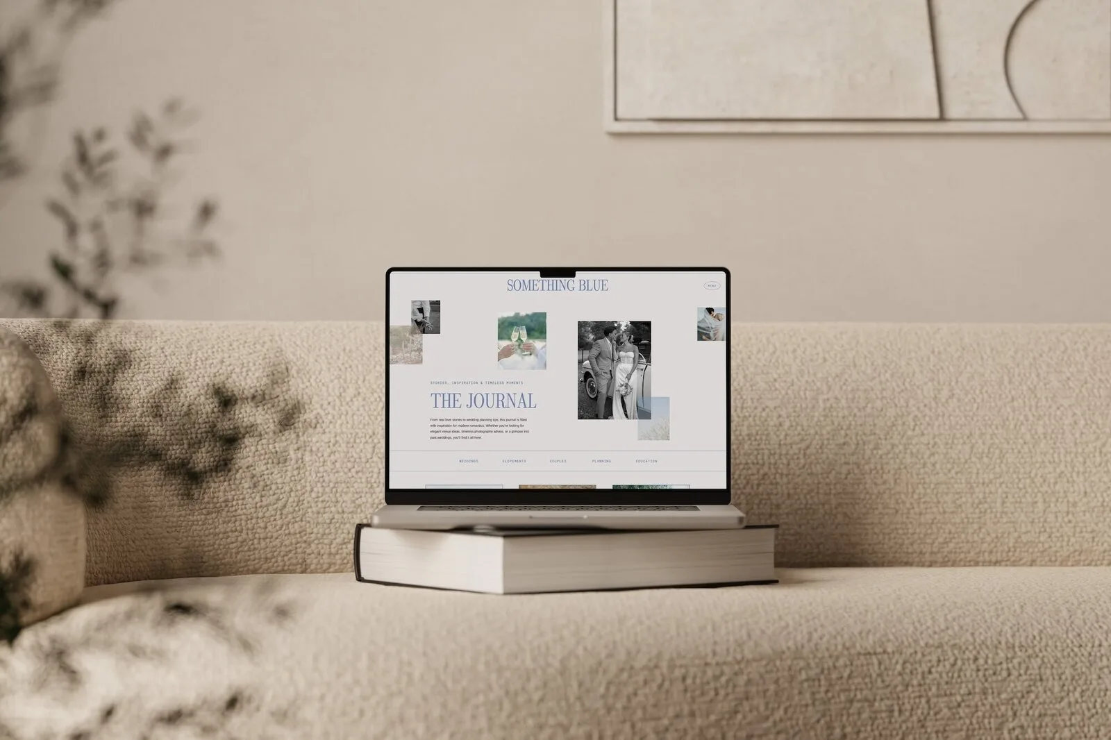
How to evaluate a Showit blog template before you buy?
When you are previewing Showit designs, it is easy to be pulled in by the homepage and ignore the blog. Here is a simple evaluation process to follow.
1. Confirm it has both Blog/Post List and Single Post layouts
Start by confirming the template includes:
- A clear Blog/Post List design (for your main blog page and category lists).
- A Single Post design that shows an actual blog article.
You can check these inside the Showit preview by looking at the blog canvases or demo blog pages. Remember, Showit documentation on blog templates notes that every site design in its library includes both, so if you do not see them in the marketing preview, you can still find them in the back-end layouts.
If either layout looks like an afterthought, treat that as a red flag.
2. Check that the Single Post uses the post title as the H1
On the Single Post demo:
- Find the main title.
- Make sure it is clearly the post title, not a generic label.
- Confirm it has room for longer, descriptive titles.
If the demo only shows a tiny or decorative post title, imagine a real title like “Romantic fall wedding at a countryside barn” and see if it would still look clean.
3. Look for date, categories, and author bio
Scan the Single Post layout and ask:
- Can I immediately see when this post was published?
- Can I see what type of post it is, via categories?
- Is there space for an author bio at the end, even if the demo text is generic?
If any of these are missing, imagine where you would put them. If you cannot see a natural spot that works on both desktop and mobile, you may have to do more customisation than you want.
4. Confirm left alignment and scannability
Look at:
- Post title alignment.
- Body text alignment.
- Headings and captions.
- Any quote blocks or callouts.
Ideally everything is:
- Left aligned.
- Broken into short paragraphs.
- Supported by headings or subheadings that are easy to scan down the left side.
If the demo blog uses centered paragraphs or fully justified text for the main body copy, you will probably want to switch that to left alignment in your own version.
5. Test how it handles images
On a real wedding post, you will likely add a lot more images than the demo.
Ask:
- Does the layout show a clear rhythm between text and images?
- Is there a comfortable margin between images, or do they feel cramped?
- Does anything about the design make it hard to imagine adding 50+ images?
If you see overlapping elements, text sitting directly on top of imagery, or complex collage sections, those may look beautiful in a demo but feel heavy to maintain in weekly blogging.
6. Confirm there is a clear CTA button
Find the CTA on the Single Post:
- Is there a proper button or clear link near the end of the post?
- Does it stand out from the body text, without screaming?
- Is it aligned with the content column?
If a template has no built-in CTA in the Single Post view, you will need to add one yourself before you start publishing.
If you are then ready to launch with your chosen template, my Showit website launch checklist and my step-by-step guide on how to launch your Showit website template can help you go live smoothly.
Customizing your Showit blog layout safely
Once you have a template you like, you can safely customise the layout to better match your brand and workflow, without breaking how WordPress feeds content into it.
Here is what you can adjust with confidence.
Safe customisations
In Showit, you can use the design settings and canvas controls to:
- Change fonts to match your brand typography.
- Adjust colors for headings, body text, backgrounds, and buttons.
- Tweak text placement so titles, dates, and categories sit exactly where you want.
- Set everything to left aligned in your design settings, so you do not have to repeat alignment changes on every post.
Showit documentation on blog templates notes that you can adjust blog aesthetics like fonts, colors, and text placement. That is where most of your visual customisation lives.
What not to touch?
When you edit a blog template, Showit warns against deleting the special blog-connected elements. They often show in the template as placeholder content.
You should *not*:
- Delete WordPress-connected text boxes like “Post Title,” “Post Content,” date fields, or category labels.
- Remove repeating canvases that are specifically marked for blog posts, unless you know how to reconnect them.
Showit documentation on blog templates explains that you should not delete placeholder content when customising a blog template. This is because those placeholders are what allow WordPress to send your posts into the layout.
Instead of deleting:
- Hide or move elements you do not plan to use.
- Restyle them (font, size, alignment, color) to fit your brand.
- Replace filler text and images with your real content, but keep the structure.
If you keep the connections intact and focus on styling and alignment, you will have a custom-looking blog that is still easy to publish to.
How your Showit blog layout fits into your overall site strategy?
Your blog does not sit on its own. It should work with your portfolio, services, and contact pages as part of one clear path.
On a wedding photography site, blog posts often act as first-touch content from search or Pinterest. A couple might land first on:
- A real wedding at their venue.
- An elopement guide for a specific location.
- A gallery-heavy post about a style they love.
Your blog layout should make it easy to:
- Discover related posts. For example, more weddings at the same venue, more elopements, or more planning tips. Categories and clear titles help here.
- Move to your portfolio. A simple in-text link or small section like “See more weddings in my portfolio” can live near the end of each post.
- Find your services and pricing. You can include a discreet link to your investment or services page near your CTA button.
- Reach your contact form. Your CTA button can lead directly to your contact page, so there is no guesswork.
If you keep your layout clean, left aligned, and consistent across posts, couples will recognise your site structure quickly and feel more confident taking that next step.
Quick Showit blog layout checklist for photographers
You can use this as a quick reference while shopping for or tweaking your Showit blog template:
- [ ] Template includes both Blog/Post List and Single Post layouts.
- [ ] Single Post layout uses the post title as the H1.
- [ ] Date of the blog post is visible near the top of each Single Post.
- [ ] Categories show on both the Blog/Post List and Single Post views.
- [ ] Author bio section is included or easy to add at the end of each post.
- [ ] There is room for a simple table of contents near the top for long posts.
- [ ] All main text elements are left aligned (titles, body text, headings, captions).
- [ ] Content width is comfortable to read on desktop and mobile, not stretching too wide.
- [ ] Images have consistent spacing and stack well on mobile.
- [ ] Each Single Post includes a clear CTA button (for example, “Enquire about your date”).
- [ ] Blog/Post List view is easy to skim, with titles, dates, and categories clearly visible.
If your current template misses several of these, it might be time to switch to a blog layout that supports how you actually want to use your site.
FAQs about Showit blog layouts for photographers
What should a Showit blog layout include for wedding photographers?
A strong Showit blog layout needs a title H1, dates, categories, left-aligned text, image space, an author bio, a TOC, and an enquiry button. Your Blog/Post List should also make titles, dates, categories, and featured images easy to skim.
How do Showit and WordPress work together for blog posts?
Showit controls the visual layout of your blog pages, including where titles, dates, categories, author bio, and buttons sit. WordPress holds the actual blog post content and media. You design the templates in Showit, then write and upload your posts in WordPress. WordPress sends the content into the Showit layouts through special connected fields.
How can I tell if a Showit blog template will work well for image-heavy posts?
A good template shows clear text-and-image rhythm, consistent spacing, a single mobile column, and room for many photos. If the Single Post demo already looks comfortable with multiple images and short text blocks, it will usually handle real wedding posts well.
Can I customize my Showit blog layout without breaking my blog?
Yes, you can safely customise fonts, colors, text placement, and alignment in Showit. You can also adjust spacing, margins, and button styles so the blog matches your brand. The key is not to delete the WordPress-connected placeholders (like post title or post content boxes) that Showit uses to pull your posts into the layout. Restyle and move those elements rather than removing them.
How does my blog layout support enquiries on a photographer website?
Your blog layout supports enquiries by clarifying each post’s topic, showing dates and categories, using scannable left-aligned text, and ending with a clear contact button. When a couple reads a relevant post and then sees an easy next step, your blog becomes a quiet but consistent enquiry driver.
When you are ready to put this into practice with a template built for photographers, you can explore my collection and Shop Showit templates that already prioritise clean blog layouts, left-aligned content, and clear enquiry paths.
DOWNLOAD A FREEBIE
How to Launch a Showit Website Start to Finish
Looking to launch your dream website, but feeling overwhelmed with where to start? From purchasing your domain to publishing your site, this checklist will guide you through each step so you can launch your website with ease.