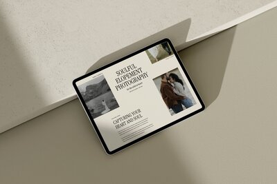
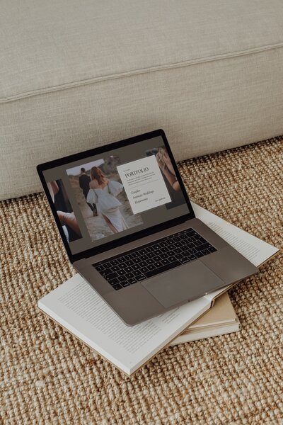
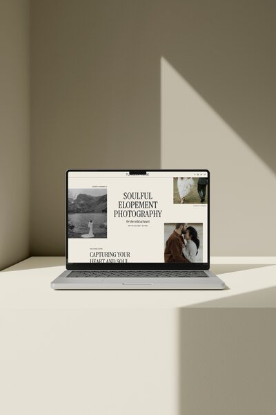
- The “best” Showit template is the one that fits your photography style, booking flow and comfort with tech, not just the prettiest demo.
- Minimal, editorial designs like Vanilla and Oak’s Atticus tend to work well for photographers who want a custom-looking site they can launch quickly.
- Use this guide to check style, booking journey, SEO, mobile and customization so you can choose a template once and actually go live.
*Affiliate disclosure: This post contains affiliate links, which means that we may receive compensation if you make a purchase using these links.*
You want your website to feel as curated as your galleries, without vanishing into a months-long custom design project. You also want it to book real couples, not just sit there as a pretty online portfolio.
This guide walks you through how to choose Showit templates for photographers that feel minimal and editorial, look custom, and are realistic to launch on your own.
How to use this guide to find your best Showit template?
There is no single “best” Showit template for wedding photographers. The best one is the template that fits your photography style, booking flow and tech comfort level.
Use this guide as a decision filter, not a catalog. You will:
- Get clear on the visual style that fits your work and clients.
- Check that a template supports a clear inquiry path, not just nice layouts.
- Make sure the SEO and blog structure can grow with you.
- Look closely at the mobile experience.
- Decide how much customization and support you want, based on your timeline.

Start here: What makes a Showit template “the best” for wedding photographers?
A Showit template is a strong fit for a wedding photographer when it does six things well:
- Visual style: The design should either match or elevate how your work feels. For many photographers that means clean, minimal, editorial layouts, with lots of white space and typography that feels modern and calm.
- Portfolio presentation: Your galleries and featured stories need space to breathe. Good templates let you show full wedding stories, detail shots and portraits in a way that feels intentional, not cluttered.
- Booking strategy: Looks alone are not enough. The navigation, page layouts and calls to action should guide couples from “Who is this?” to “I want to inquire” in a few clear steps.
- SEO foundation: Showit’s SEO tools documentation notes that Showit website templates have SEO fields for page titles and descriptions and image or media SEO fields. The template you choose should have places for real text so you can actually use those fields.
- Mobile experience: You can assume many couples will discover you or check you out first on their phone. Google’s mobile-first indexing guidance says Google uses the mobile version of a site for indexing and ranking, so the mobile design of your template matters for more than looks.
- Ease of customization: A good template lets you change fonts, colors, images and copy without needing to touch code. It feels flexible enough to look like “you”, but structured enough that you are not redesigning from scratch.
Keep these in mind as you compare demos. If a template fails on any one of these pillars for your needs, it is not your “best” template, even if you love the homepage.
Step 1: Choose a visual style that actually fits your work
Before you fall for any specific template, decide what type of design best supports your photography and your ideal couples.
Here is how to think about the main style directions.
Minimal, editorial
Choose a minimal, editorial template if:
- Your work is clean, intentional and story-driven.
- You shoot modern weddings, stylish couples, fashion-forward details or venues with interesting architecture.
- You want your website to feel like a magazine spread or gallery wall, not a scrapbook.
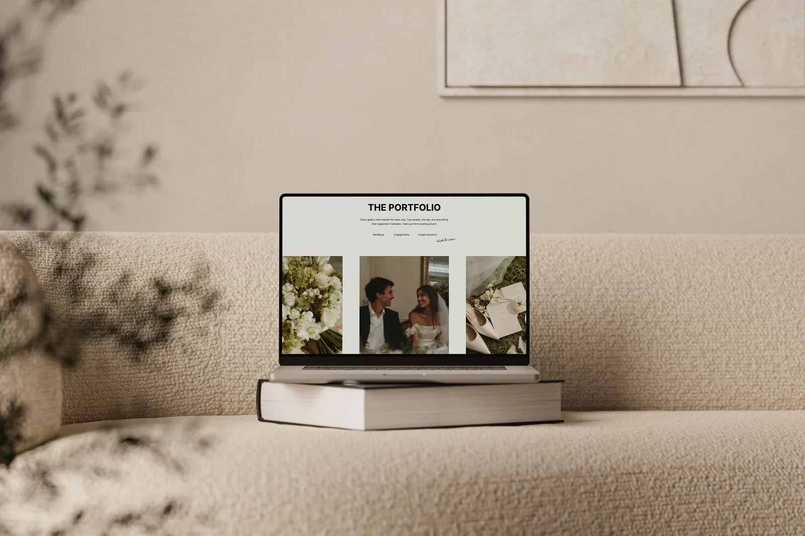
A template like Atticus — Modern editorial Showit Website template for photographers focuses on:
- Lots of white or neutral space.
- Simple, refined typography.
- Image-forward layouts that let a few strong photos carry the page.
If most of your couples send you Pinterest boards full of chic, modern references, this style usually clicks.
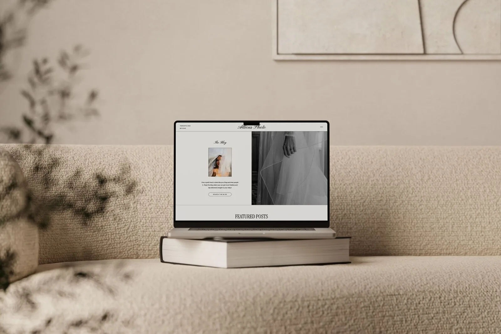
Atticus modern editorial Showit website template for photographers
Romantic and soft
A romantic design fits if:
- Your editing leans light, airy, or pastel.
- You shoot classic or garden weddings, soft florals and sentimental details.
- Your couples care about romance and emotion first.
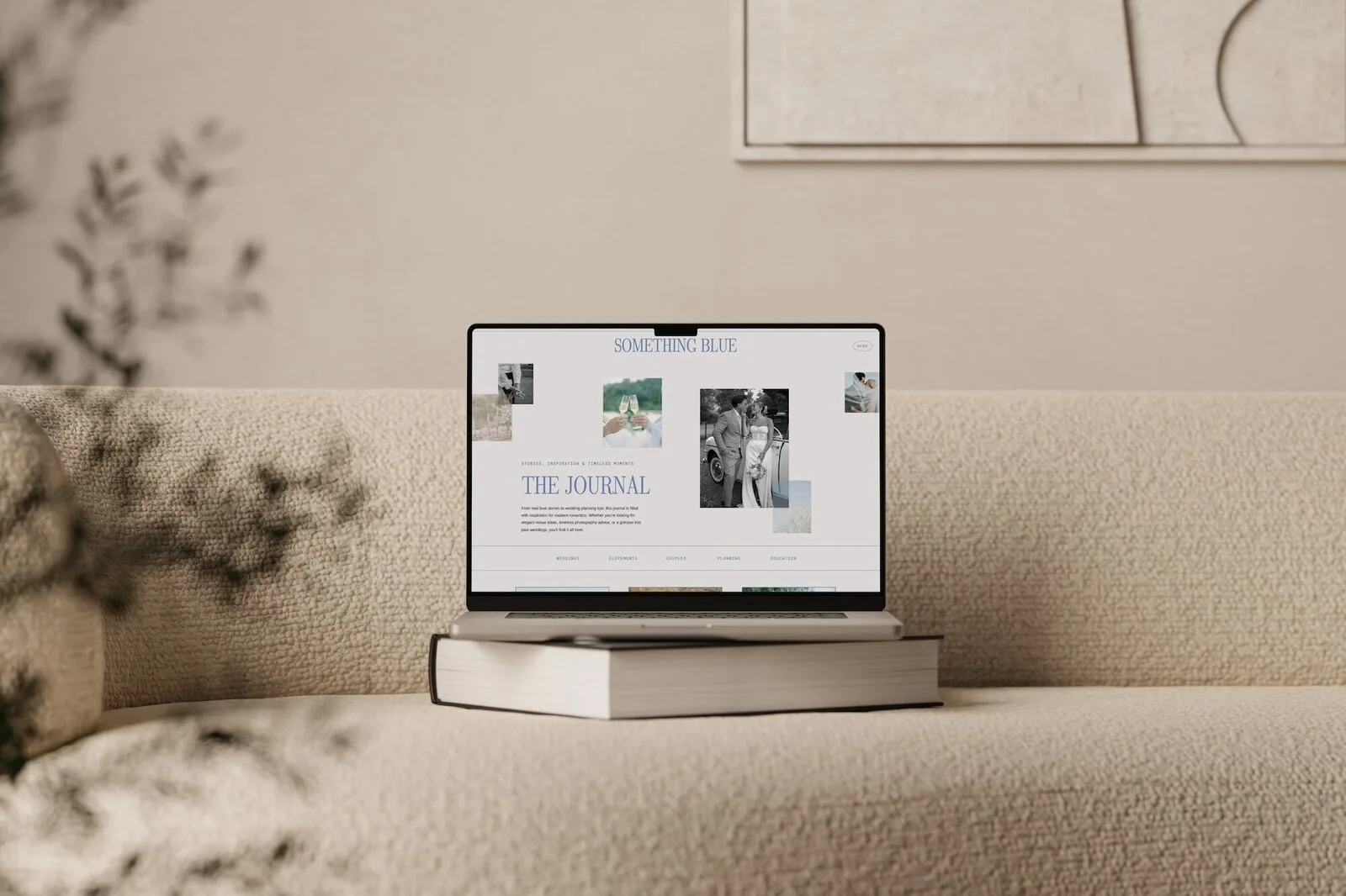
A template like Something Blue — Romantic Showit Website Template for Wedding Photographers is created for this feel, with a gentle, romantic aesthetic that still stays clean and professional.
Romantic Showit website template for wedding photographers Something Blue
Retro or nostalgic
Retro or film-inspired designs are a good match if:
- You shoot with film or emulate it in your edits.
- Your work has grit, grain and a sense of nostalgia.
- Your couples love character and personality over polish.
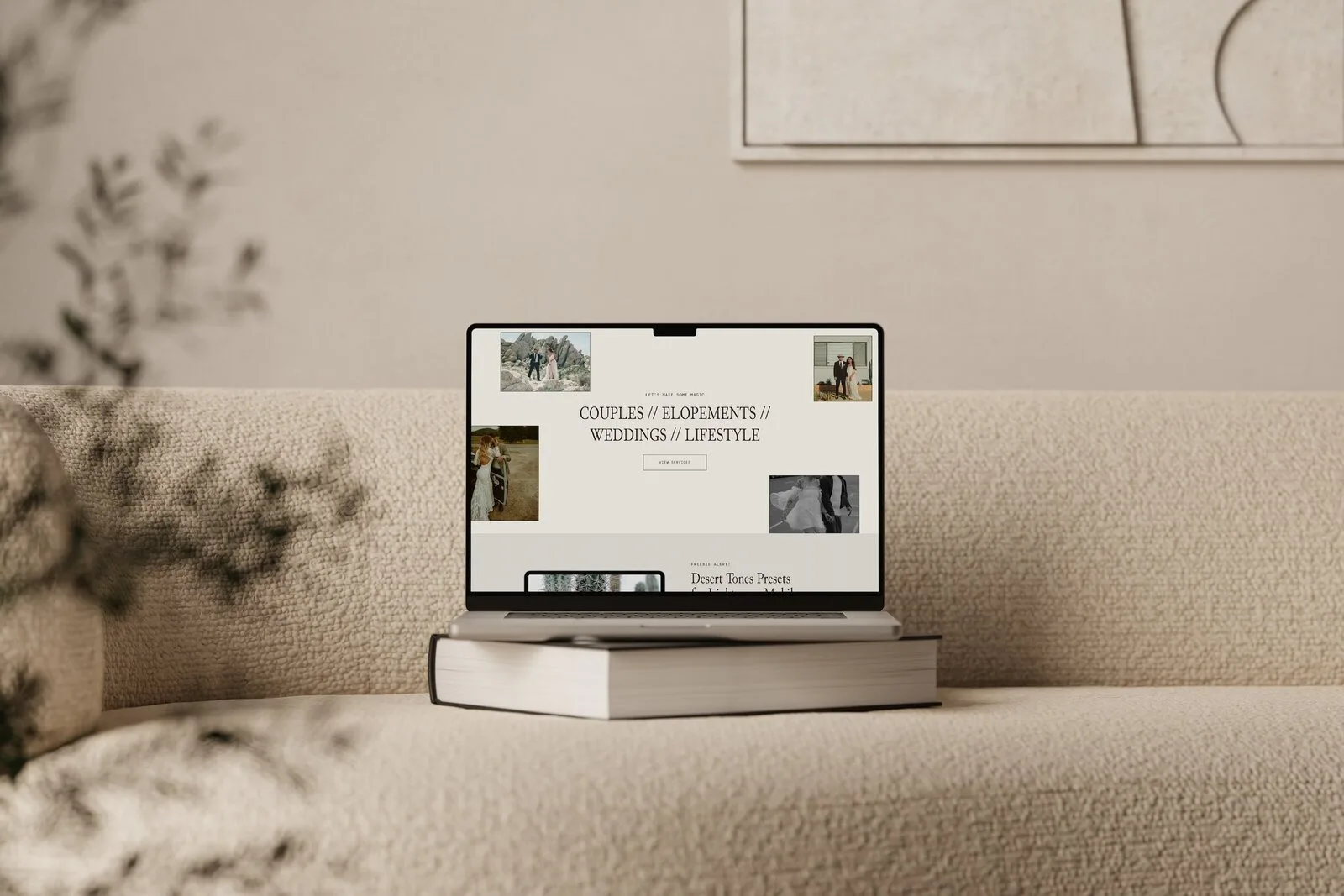
Jericho — Retro Film Showit Website Template for Wedding Photographers is built for this, leaning into a retro film mood that suits playful, nostalgic brands.
Retro Film Showit website template for wedding photographers Jericho
Moody and earthy
Choose moody or earthy if:
- Your work is dramatic, contrasty, or heavily inspired by landscapes.
- You shoot elopements, destination weddings or nature-focused celebrations.
- Your couples care more about adventure than tradition.
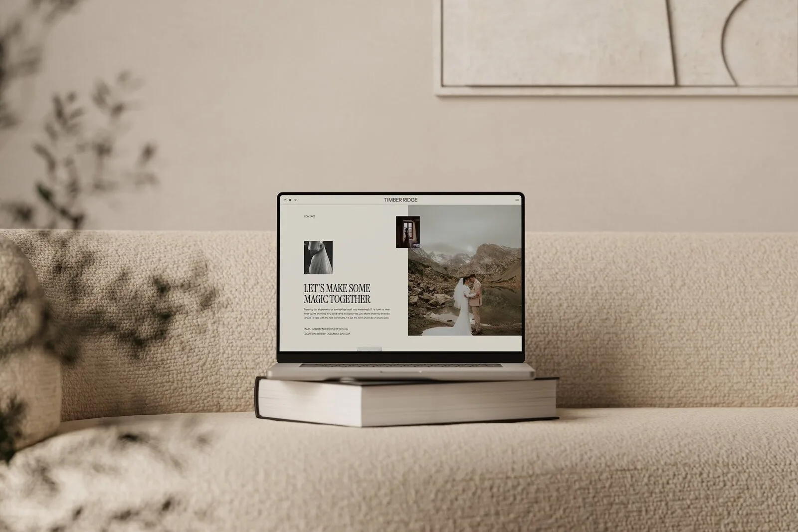
Timber Ridge — Moody Earthy Showit Website Template for Elopement Photographers is designed for this look, with a grounded, earthy style that suits elopement and outdoor-focused brands.
Moody earthy Showit website template for elopement photographers Timber Ridge
Overtly luxurious
A more luxurious design will make sense if:
- You photograph high-end venues and editorial-level details.
- Your couples are investing heavily in design, florals and planning.
- You want your site to feel like a luxury brand.
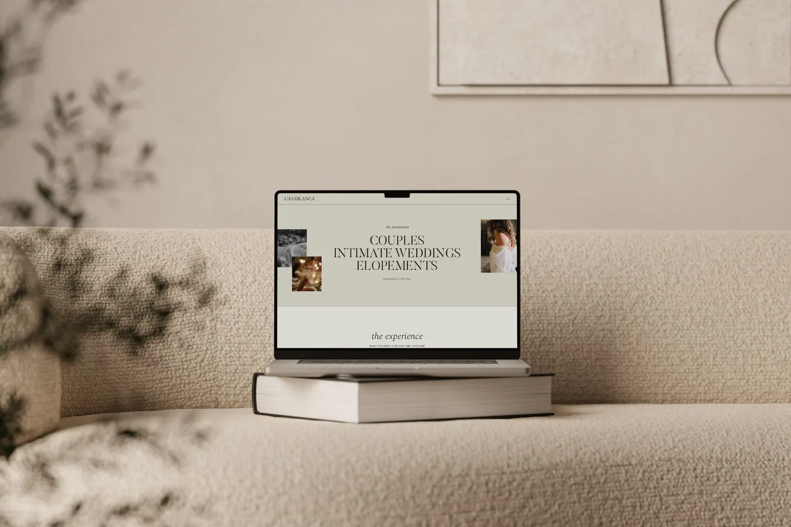
Casablanca — Luxury Showit Website Template for Wedding Photographers is created for this luxury positioning, while still keeping things refined.
Luxury Showit website template for wedding photographers Casablanca
Heirloom editorial
Heirloom editorial bridges timeless with fashion-forward. It works if:
- Your work feels classic but not old-fashioned.
- You attract couples who care about legacy, albums and prints.
- You want a site that feels both refined and warm.
Sunday Best — Heirloom editorial Showit Website Template for wedding Photographers is designed with this in mind, pairing editorial layouts with a sense of history and story.
Heirloom editorial Showit website template for wedding photographers Sunday Best
If you are unsure, start by asking: “If my best client landed on my homepage, would they recognize themselves in this style?” If the answer is yes, you are in the right lane. If they would feel out of place, choose a different template family.
Step 2: Check that the template supports your booking journey
Once style feels right, the next filter is your booking journey. Your Showit template should make it easy for a cold visitor to become an inquiry.
Most wedding photographers need a similar set of core pages:
- Home
A quick snapshot of who you are, what you do, who you serve and how to inquire. Look for a template where the homepage has space for a short positioning statement, a few strong images and a clear path to your portfolio and contact page.
- Portfolio / galleries
You need flexible layouts to show full wedding stories and highlight your best work. Check that the template has options for featured galleries, not just a single grid. Make sure it feels natural for a couple to click from a gallery to your experience or pricing page.
- Pricing or experience
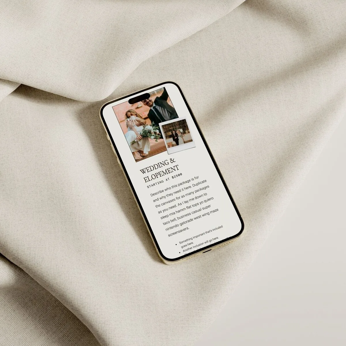
Couples want to know what working with you looks like and roughly what it costs. A good template gives you space to outline your process, what is included and starting prices or investment context, without pages feeling text-heavy or cramped.
- About
This is where your personality and approach can help someone choose you over another photographer with similar work. Look for layouts that give you space for a short story, a portrait and maybe a few values or “why me” points.
- Contact
The contact page should be straightforward and easy to find from any page. You want a clear form, instructions about what happens next and maybe an email or alternative contact method.
Showit’s SEO tools documentation notes that pages have SEO fields for titles and descriptions, which work best when templates leave room for real copy. When you look at a template, ask yourself:
- Does each core page have space for short, descriptive headings?
- Can you add a couple of paragraphs or bullet points without breaking the layout?
- Are there clear call-to-action buttons that point people to inquire or view galleries?
If you cannot see where your words fit, you may struggle to customize it in a way that supports your booking flow.

Step 3: Make sure the SEO and blog setup will work for you
You do not need to be an SEO expert to choose a Showit template that can support visibility and blogging. You just need to check that the structure will work with the tools Showit provides.
Showit’s help documentation on SEO tools says pages have SEO fields for titles and descriptions and image or media SEO fields. This means:
- You can give each page a clear, descriptive title and description.
- You can add information to your images, which is helpful when your site is so visual.
To make the most of this, your template still needs:
- A sensible page hierarchy, so your main pages (home, portfolio, experience, about, contact) are easy to find.
- Room for headings, supporting text and links so your pages are not just image walls.
For blogging, Showit explains that the website is built visually in Showit while the blog runs through WordPress. For you, this means:
- Your main site design and page layouts live in Showit.
- Your blog posts are created and managed on WordPress, while still matching your Showit design.
When you choose a template, check:
- Does the demo include a blog layout you like?
- Do the blog pages have space for post titles, featured images and readable text?
- Does the blog feel visually connected to the rest of the site?
If you want more help on the SEO side once you have picked a template, you can use a resource like Easy DIY SEO for Showit to walk through the practical setup.
Step 4: Prioritize mobile experience and load feel
For most couples, your website will first appear on their phone, not a desktop. How your template feels on mobile will shape both their impression of your brand and how easily they can inquire.
Google’s mobile-first indexing guidance says Google uses the mobile version of a site for indexing and ranking. So when you preview templates, make a habit of checking the mobile view first.
Look for:
- Readable typography
Headlines and body text should be large enough to read without zooming.
- Easy navigation
A simple burger menu or clear navigation at the top. Avoid templates where buttons become tiny or menus cover the entire screen in a confusing way.
- Flow of content
On mobile, long scrolling is normal, but the sections should stack in a sensible order. You want a couple to get an overview, see a few strong images, understand what you offer and find the inquiry button without hunting.
- Perceived load feel
You do not have to measure exact speed, but you can feel whether a template loads smoothly on mobile previews or if it feels heavy. Fewer overlapping animations and clean layouts usually feel faster.
If a template looks beautiful on desktop but clumsy on mobile, it is not the best choice for a modern photography brand.
Step 5: Consider customization, support, and your timeline
You likely want a site that feels custom without hiring a custom designer right now. Showit templates are built for visual customization, which is why they are a good fit for DIY-minded photographers.
Still, your timeline and comfort with tweaking things matter.
Ask yourself:
- How quickly do I need to launch?
If you want to go live within a week, choose a template where you already like most of the layouts. Atticus, for example, is designed to look modern and editorial out of the box, so you can mostly swap in your own work and copy.
- How much do I want to customize?
If you enjoy design, you might want to play more. If you do not, pick a template where the fonts, colors and layout already feel 80 percent like your dream site.
Showit’s Help Center has an article about choosing the right pricing plan, which reflects that people often need help deciding between website-only, basic blog and more advanced blog options. It is worth checking that article when you are ready to sign up so your plan matches how you want to use blogging.
If you want a step-by-step walkthrough of getting from purchase to launch, my guide How to launch your Showit website template is a practical companion once you have picked your template.
Which Vanilla and Oak Showit template fits your style?
Using the criteria from earlier, here is how my templates line up, so you can match your style and booking goals to a specific option.
Atticus — best for minimal, editorial brands
If you read “minimal and editorial” and thought “yes, that is me,” Atticus is likely your best starting point.
Atticus is a modern editorial Showit website template for photographers. It is especially suited if you want:
- A clean, minimal layout that highlights your strongest images.
- A custom-feeling site without starting from scratch.
- A clear, streamlined booking journey from homepage to inquiry.
Because so many photographers already use words like minimal and editorial when describing what they want, and usually gravitate toward Atticus, it is the primary recommendation for anyone wanting a modern, image-forward site that still feels approachable to customize.
You can explore the details here: Atticus modern editorial Showit website template for photographers.
Casablanca — best for luxury wedding photographers
Casablanca is the Luxury Showit Website Template for Wedding Photographers in my collection. It fits if:
- You shoot high-end, design-led weddings.
- You want your site to position you clearly as a luxury option.
- Your clients care about a polished, elevated aesthetic.
Jericho — best for retro film and playful brands
Jericho is the Retro Film Showit Website Template for Wedding Photographers. Choose it if:
- Your work has a strong film or retro influence.
- You want a site that feels characterful, not too serious.
- You attract couples who love a bit of nostalgia.
Something Blue — best for romantic, classic photographers
Something Blue is the Romantic Showit Website Template for Wedding Photographers. It is a fit if:
- Your editing is soft, light, or classic.
- Your couples love romance, heirlooms and timeless details.
- You want your website to feel gentle and inviting.
Timber Ridge — best for moody elopement photographers
Timber Ridge is the Moody Earthy Showit Website Template for Elopement Photographers. It suits you if:
- You shoot elopements, adventure sessions or nature-heavy weddings.
- Your work is moody or earthy.
- You want your brand to feel grounded and outdoorsy.
Sunday Best — best for heirloom editorial brands
Sunday Best is the Heirloom editorial Showit Website Template for wedding Photographers. It is ideal if:
- You balance modern editorial work with a sense of legacy.
- Albums, prints and story matter deeply to your clients.
- You want a site that feels both refined and warm.
If you want to see all of these side by side, you can browse the full collection here: Shop Showit templates for wedding photographers.
FAQ: Quick answers about Showit templates for photographers
Is Showit only for photographers?
No. Showit’s FAQs and troubleshooting collection includes a recurring question about whether the platform is only for photographers. Photographers are a key audience, but they are not the only ones using Showit.
Can I try Showit and templates before committing?
Showit’s pricing and trial page explains that the Help Center directly answers whether users can try the platform before committing. You can check that page for current trial details and how they work with different plans.
For templates, you can explore demos and documentation before you buy. Once you have a template, you can also work on it inside a trial Showit account before your plan starts, if that suits your timeline.
How do Showit and WordPress work together for blogging?
On Showit’s pricing page, they explain that your website is built visually in Showit, while your blog runs through WordPress. Practically, this means:
- You design your overall blog layout inside Showit.
- Your individual posts are created and published in WordPress.
- Site visitors experience it as one cohesive website.
Any template from Vanilla and Oak that includes blog layouts is designed with this Showit plus WordPress setup in mind.
When you are ready to pick your template and start building, you can choose the style that fits and move toward launch with confidence: Shop Showit Templates.
DOWNLOAD A FREEBIE
How to Launch a Showit Website Start to Finish
Looking to launch your dream website, but feeling overwhelmed with where to start? From purchasing your domain to publishing your site, this checklist will guide you through each step so you can launch your website with ease.