Launching a photography website does not have to mean building dozens of pages. To get a site live that actually works, you only need five core pages:
- Home Page
- About Page
- Portfolio Page
- Services Page
- Contact Page
Blog, Opt In, and Links Page can be helpful after the core 5 are in place. These aren’t required to launch, but can easily be added after.
If you’re building a website for your photography business and not sure what pages you actually need, you’re not alone.
Most photographers either overcomplicate it with too many pages, or keep it so minimal it’s missing key pieces. The result is a site that looks fine, but does not move couples any closer to inquiring.
The truth is, your website doesn’t need to be complicated to work. It just needs the right structure.
A lean site works when every required page has a clear job instead of adding more pages to feel complete. Here are the only 5 pages your photography website actually needs (and what each one should do).
1. Home Page
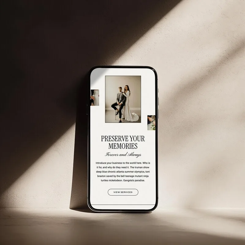
Your home page should quickly tell a couple who you are, what you do and where to go next. If they have to scroll or guess to figure that out, you lose them.
A strong home page does three jobs:
- Makes your offer clear.
- Gives a feel for your style.
- Points people to the next step, usually your services or contact.
This is where many photographers go wrong. A common homepage mistake is too much info on the homepage, and no clear path of what action the visitor should take next. Others toss a ton of photos on their homepage and not enough info, so couples admire the images but still do not know what is actually on offer.
This is where using a pre-designed website template with a clear structure can make a huge difference, especially if you do not want to learn design or development.
What to include:
- a clear headline (not just “capturing love stories”)
- a quick introduction to your work
- a preview of your portfolio
- an easy path to your services or contact page
Think of your home page as the guide. Every section should gently lead visitors toward the next page you want them to view, instead of trying to cram your entire website onto one long scroll.
2. About Page
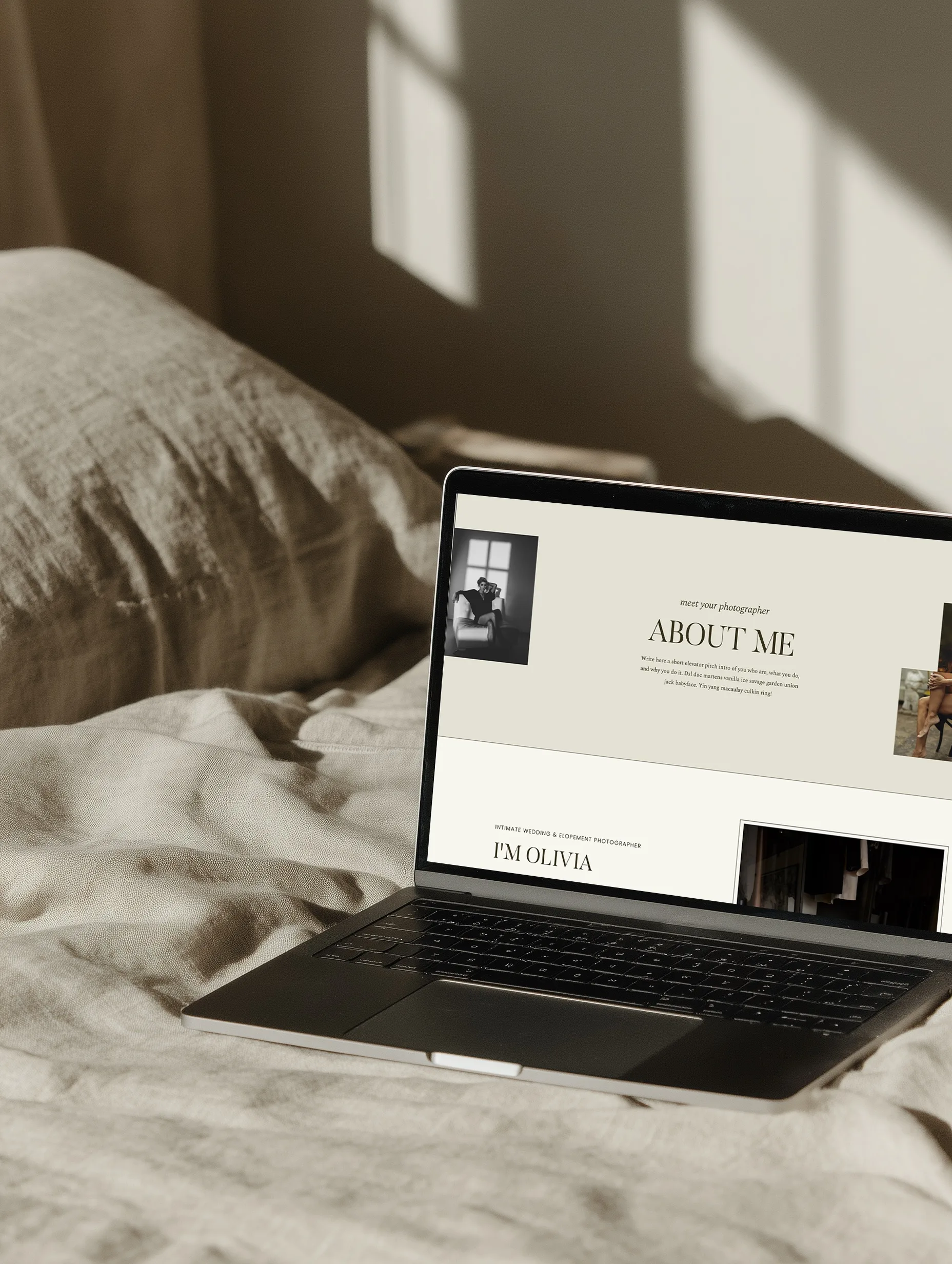
For wedding photographers, your about page is where connection happens.
Couples are inviting you into some of their most personal moments. This page should help them imagine what it feels like to have you there on the day, not just list your hobbies or your first camera.
It does not need to be a long biography. Focus on what helps a couple decide if you are the right fit to spend a full wedding day with them.
Photographer Jacob Aue Sobol says a photographer’s website should reflect who they are and what they believe in, rather than hiding their identity (source). That is exactly what this page is for.
Squarespace’s photographer-site guidance recommends an About Me page as one of the core parts of a photographer site (source), which lines up with what most wedding clients look for.
What to focus on:
- How you approach weddings. For example, are you hands-on with posing, or more documentary and fly-on-the-wall?
- What clients can expect from you on the day and in the lead up.
- A bit of personality that feels like you, so couples can get a sense of your energy and communication style.
A simple, concrete way to build trust here is to describe how you support couples during one specific part of the day, like family portraits or the timeline. That feels more real than a long list of adjectives.
The goal is not to impress, it is to help the right people feel comfortable reaching out.
3. Portfolio Page
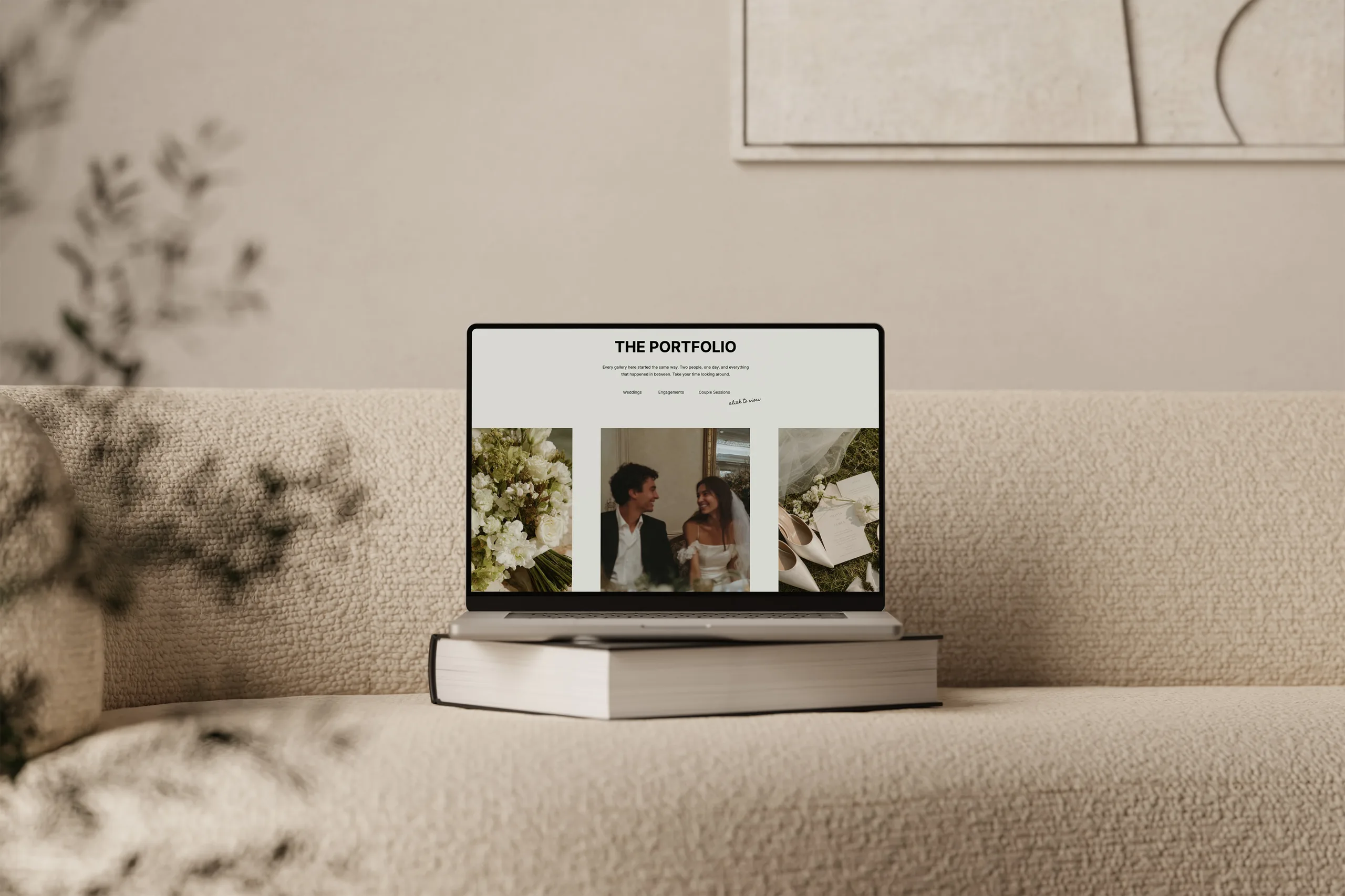
Your portfolio page is where couples decide if they like your work enough to inquire.
Your portfolio should show your best work, not all your work.
One of the most common mistakes is including too many images without intention. You don’t need to post every image from a 1 hour senior’s session. The same goes for weddings, engagements or any freelance photographer portfolio. A huge archive of every gallery can be overwhelming and actually makes your work feel less polished.
Instead, think of your portfolio page as the answer to “how to make a photography portfolio website that books more of the work I want”:
- curate your galleries to show off your best work
- keep things cohesive and a true representation of your current work and style
- show the kind of work you want to book MORE of
Quality > quantity, always.
You can organize your work in a few ways: a single highlight gallery, a small set of curated weddings, or categories like “Weddings”, “Elopements” and “Engagements”. Squarespace’s photographer-site guidance recommends dropdown navigation to organize work into categories (source), which is a good reminder that clear structure makes browsing easier.
And make sure it is easy to navigate. If someone has to dig to find your work, they will not.
If you’re unsure how to organize your galleries, looking at a professionally designed portfolio layout can help guide you.

4. Services Page
Your services page is where interest turns into action.
By the time someone lands here, they already like your work. Now they need to understand what you offer and how to move forward. This page should make that path obvious.
At a minimum, aim to clearly present the main way someone can work with you. For most wedding photographers, that means at least one core wedding package, with optional add-ons or variations if you have them. You do not need to outline every possible combination, just enough for couples to understand the general scope so an inquiry feels worth their time.
This page should clearly outline:
- what you offer
- what working with you looks like
- how to take the next step
You don’t need to list every detail, but you do need clarity.
Confusion = lost inquiries.
You can briefly walk through your process in simple steps (for example, inquire, consult, book, wedding day, gallery delivery) so couples see there is a plan and know what happens after they hit send. End the page with one clear button or link to your contact page so they know exactly what to do next.
If you struggle to explain your packages in words, it can help to write them out first, then refine before you add them to your site. Resources like guides on how much a photography website costs or what you need before working with a website designer can also give you a wider view of how your services page fits into your overall brand.
5. Contact Page
This one seems obvious, but it is often where couples hit a wall.
Your contact page should make it easy to reach out.
Someone on this page is already close to taking action, so the page should not introduce extra effort or uncertainty. They should not have to hunt for your email, wonder what to write, or guess when they will hear back.
That means:
- a simple form
- clear expectations (what happens after they inquire)
- no unnecessary friction
Your form can stay short and focused. Ask only what you actually need to reply, such as name, email, event type, date and venue. Extra long, detailed forms can feel like homework and cause people to give up.
Your contact page should also set expectations, for example by briefly stating when they can expect a reply. This alone removes a lot of hesitation.
If someone has made it to you contact page and is ready to inquire, it needs to be as simple and clear as possible to contact you.
One simple way to reduce friction is to add a line above the form reassuring people they do not need all the details figured out yet, you just need the basics to start a conversation.

Bonus: Privacy Policy
A privacy policy is not just a nice-to-have extra, it is a legal requirement in many places when you collect personal information through your website.
As a wedding photographer, your site likely gathers details like names, emails, dates, venues and sometimes even mailing addresses through your contact form or newsletter signups. That is all considered personal data.
A clear privacy policy page explains what information you collect, why you collect it, how it is stored or shared, and how someone can contact you with questions. It also helps you stay transparent about any third-party tools you use, like email marketing platforms or analytics.
Even if you are using a simple template and a basic contact form, it is important to:
- have a dedicated privacy policy page that is easy to find from your footer
- make sure the policy actually matches how you collect and use data
- update it if your tools or processes change
If you are unsure what your policy should say, talk to a legal professional or use a reputable legal template tailored to your location and business type. The key is that you do not launch a site that quietly collects personal information without telling people how you handle it.
If you want help drafting that policy, you can also explore legal templates from providers you trust, such as The Contract Shop, and choose an option that fits your business.
Bonus: optional (but highly recommended)
Once your core pages are in place, there are a few extras that can elevate the user experience on your site.
- Blog helps with SEO and brings in new traffic.
- Opt in builds your email list.
- Links page makes it easier to market your website on socials.
These aren’t required to launch, but can easily be added after.
Photography website FAQs
How many pages does a photography website really need?
For launch, you only need five: Home Page, About Page, Portfolio Page, Services Page and Contact Page. These cover the full journey from first impression to inquiry without extra clicks or distractions.
Blog, Opt In, and Links Page can be helpful after the core 5 are in place. These aren’t required to launch, but can easily be added after.
What should a photography website include to look professional?
Focus on clarity and cohesion over extras. That means consistent branding, easy-to-read text, intentional image curation, and each of the five core pages doing its specific job. Simple navigation and a contact page that works are more important than advanced features.
If you want to dig deeper into structure and visibility, you can read more about why website design matters for SEO.
How should I set up my portfolio if I shoot multiple types of work?
If you photograph weddings plus other genres, keep your main portfolio focused on the work you most want to book, then organize the rest into clear sections or galleries. The key is that couples can quickly find wedding work that looks like what they are dreaming of, without feeling lost in unrelated sessions.
If you are building a freelance photographer portfolio that covers several services, the same rule applies: lead with the type of work you want more of, then link to supporting galleries.
Can I build my photography website without coding?
Yes. You can launch a clean, effective site using no-code tools and templates, without learning development or hiring for a full custom build. If you are deciding which platform to use, it may help to compare options such as Should You Use Showit Or Pixieset For Your Photography Website, then choose based on how you prefer to design and update your site.
Ready to build your 5 essential pages
Sticking to these five pages keeps your photography website focused on what actually matters for you and your couples. They help the right people find you, understand what you do, and feel confident reaching out. When every page has a clear job, you do not need endless extras to look professional.
This is exactly why many photographers choose to start with a template. Instead of figuring out your layout, structure, and flow from scratch, you are starting with a website that is already designed to work. You simply make it your own.
If you want help getting those five pages live faster, you can follow this step-by-step guide on how to launch your Showit website template.
I sell Showit website templates and Canva templates for the wedding industry, so you know what you are getting before you commit.
When you are ready to build or refresh your own site with these five pages in mind, you can Shop Showit Templates at Shop Showit Templates.
DOWNLOAD A FREEBIE
How to Launch a Showit Website Start to Finish
Looking to launch your dream website, but feeling overwhelmed with where to start? From purchasing your domain to publishing your site, this checklist will guide you through each step so you can launch your website with ease.