- Start with your brand foundations, then set your colors and fonts inside Showit’s Design Settings so they apply everywhere.
- Swap in cohesive photos, rewrite key copy, and lightly tweak layouts and mobile views so the template fits your work and words.
- Aim for “clearly my brand” rather than “perfect”, then launch and refine over time.
Start here: what it really means to customize a Showit template to your brand
When you buy a Showit template, it looks polished in the demo, then a bit chaotic once your own images and words start going in. The gap between “pretty demo site” and “this feels like me” is where a lot of wedding photographers get stuck.
Customizing your Showit template to match your brand is not about rebuilding every canvas or learning code. It is about taking the visual and verbal identity you already have and applying it with intention, in the right order, so the whole site feels consistent.
For a wedding photographer, “matching your brand” usually looks like:
- Colors that feel like your editing style and client experience, used consistently.
- Fonts that fit your vibe and are easy to read.
- Photos that show your true style, not just your “prettiest” individual images.
- Copy that sounds like how you speak to your couples, not filler text.
- Layouts that support your content, instead of forcing your story into boxes that do not fit.
A template gives you a solid starting point and structure. Your job is to make smart, focused changes so it feels custom, without disappearing into an endless design project. The steps below walk you through that process in a brand-first order that I use when I customize Showit templates for wedding professionals.
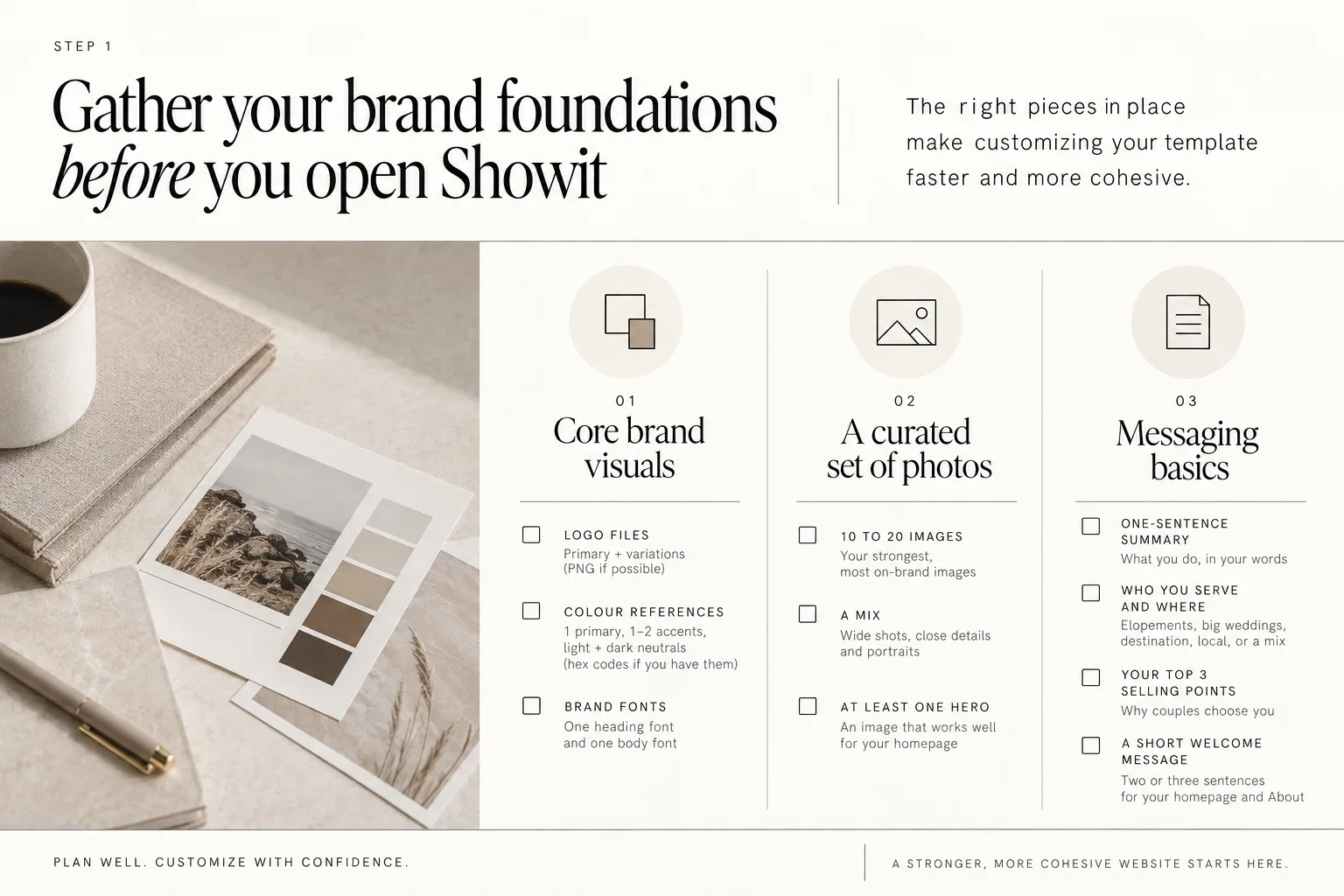
Step 1: Gather your brand foundations before you open Showit
Opening your new template before you are ready is like starting a wedding without a shot list. You can do it, but it will be slower, more stressful, and your results will feel less cohesive.
Before you log in to Showit, gather these pieces:
1. Your core brand visuals
You do not need a full designer-created brand to start. You do need some simple, consistent choices.
Have these ready in a folder:
- Logo files
Your primary logo and any simple variations you actually use (for example, a horizontal version and a stacked version). PNG files with transparent backgrounds are the most useful.
- Color references
At a minimum, choose:
- 1 primary brand color.
- 1 or 2 accent colors.
- Light and dark neutrals.
If you have hex codes, keep them handy. If not, choose reference colors from images in your portfolio that feel most like “your brand” so you can match them later.
- Brand fonts
Decide on:
- One heading font.
- One body text font.
If you do not have formal brand fonts, pick two you like that are easy to read and fit how you want clients to feel (for example, soft and romantic, minimal and editorial, bold and fun).
2. A small, curated set of photos
You will swap more images in later, but starting with a curated set keeps your early decisions consistent.
For now, gather:
- 10 to 20 of your strongest, most on-brand images.
- A mix of:
- Wide shots that work well as banners and backgrounds.
- Close details and portraits that work in smaller spaces.
- At least one image that feels like a clear “hero” for your homepage.
Think about consistency over perfection. If you mostly shoot warm, golden-hour weddings, do not mix in a few cool-toned indoor images just because they are favorites.
3. Your messaging basics
You do not need every word finished to start. A few key pieces will stop you from stalling later.
Write down:
- Your one-sentence summary
For example, “I photograph candid, coastal weddings for relaxed, travel-loving couples.”
- Who you serve and where
Elopements, big weddings, destination, local, or a mix.
- Your top 3 selling points
These are the reasons couples choose you, in your own words.
- A short welcome message
Two or three sentences you can use on your homepage hero and About section.
Having these foundations ready means you are deciding what your brand is before you start moving boxes around. That is what makes customizing your template faster and more cohesive across all pages.
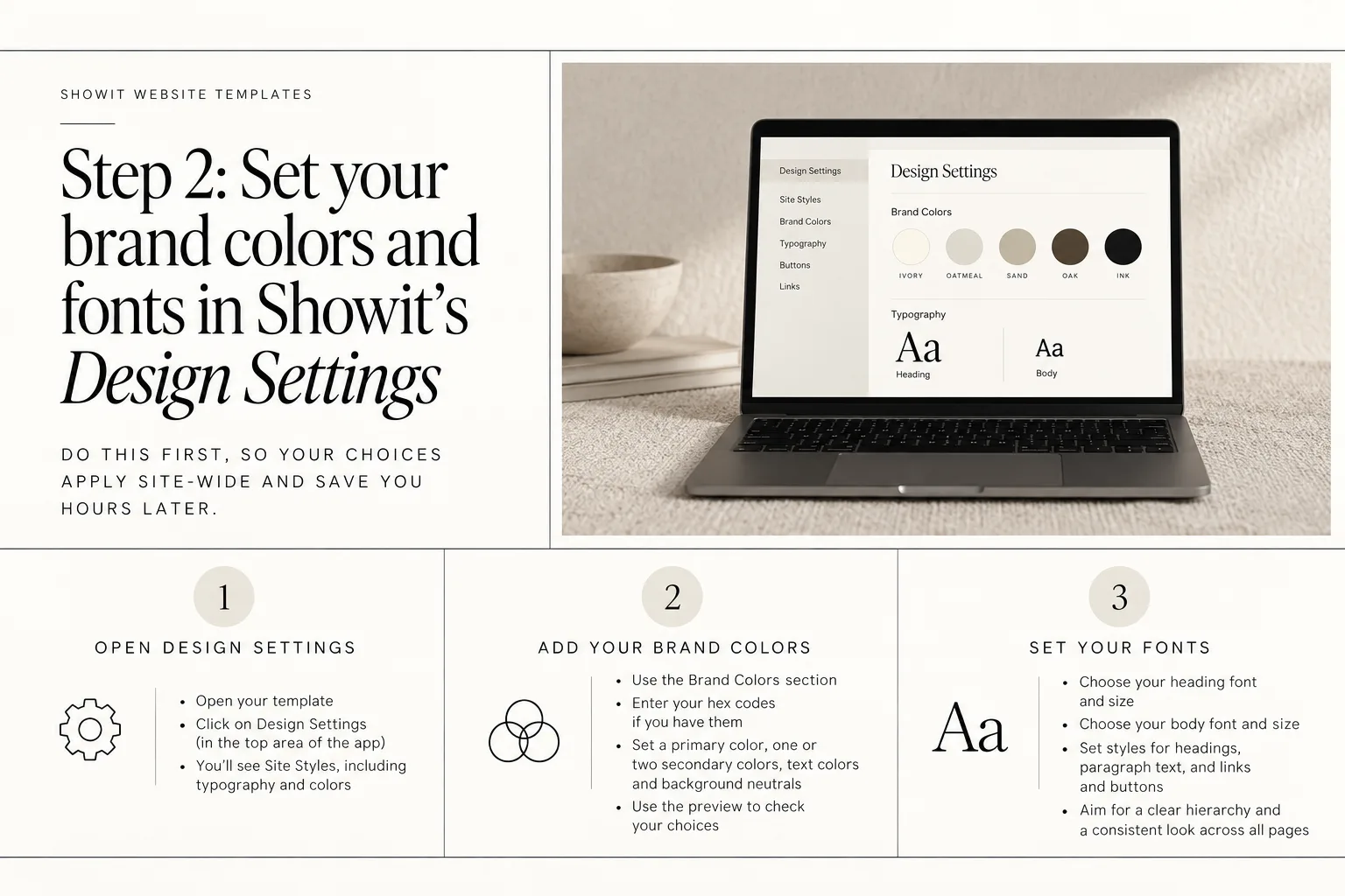
Step 2: Set your brand colors and fonts in Showit’s Design Settings
Once you have your brand basics, resist the urge to jump straight into the homepage canvases. In Showit, your first stop should be Design Settings.
Showit recommends setting brand colors and fonts in Design Settings before starting design work, and they provide getting started guidance on this at https://showit.com/get-started
Doing this first saves you hours later, because your choices apply site-wide instead of canvas by canvas.
1. Open Design Settings
Inside Showit:
- Open your template.
- Click on Design Settings (in the top area of the app).
You will see sections for Site Styles, including typography and colors.
2. Add your brand colors
Showit’s Brand Colors have their own section inside Design Settings and can be previewed across pages before saving. Use this to your advantage.
- Enter your hex codes if you have them.
- Set:
- A primary color for buttons and key accents.
- One or two secondary colors.
- Text colors (usually a dark neutral).
- Background neutrals (often light or off-white).
As you adjust, use the preview to check that:
- Text is readable on its background.
- Buttons stand out enough to be easy to spot.
- Colors feel like your brand, not the original template demo.
3. Set your fonts
Still in Design Settings:
- Choose your heading font and size.
- Choose your body font and size.
- Set styles for:
- Headings.
- Paragraph text.
- Links and buttons.
Aim for:
- Clear hierarchy (headings obviously bigger than body text).
- Comfortable reading on both desktop and mobile.
- A consistent look across all pages.
When fonts and colors are set at the Design Settings level, you can customize showit templates to match your brand far more quickly. Every future section you touch will already be wearing your “clothes”.
If you want a deeper dive into what is possible, I have also written about how customizable Showit templates really are.
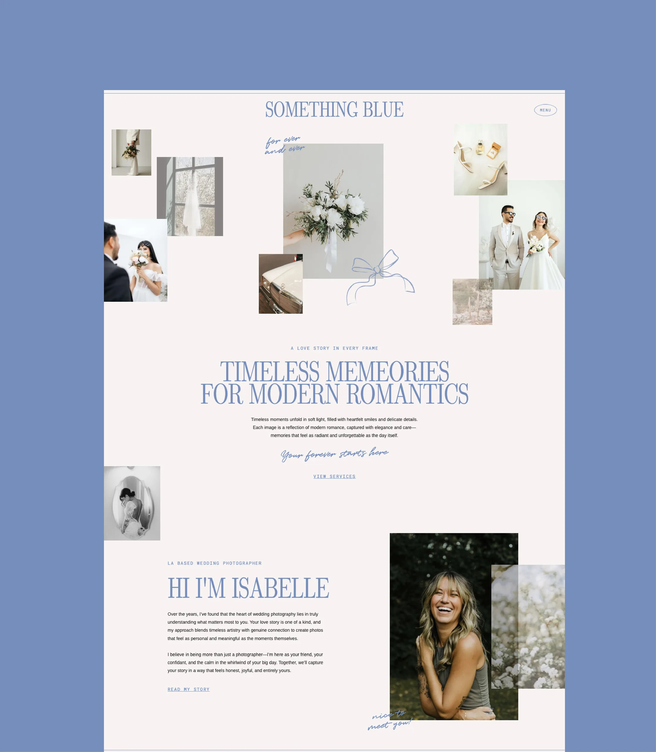
Step 3: Customize your homepage to feel unmistakably “you”
Your homepage carries the first impression. It is where couples decide whether to click deeper or close the tab. This is the best place to focus your early customization energy.
Here is the order I recommend.
1. Update the hero section
The hero is the very top of your homepage. It usually includes a large image, your main headline and a button.
Change, in this order:
- Hero image
Use one of your strongest, most on-brand photos. It should:
- Work well with the text overlay.
- Represent the kind of weddings you want more of.
- Feel like the overall mood of your brand.
- Headline
Replace the template headline with a single, clear line. For example:
- Who you are and what you do.
- Or who you serve and what makes your work different.
- Subheading or short paragraph
Use your welcome message from Step 1. Keep it short and conversational.
- Primary call to action (CTA) button
Change the text to something specific like:
- “View wedding galleries”
- “See pricing and availability”
Link it to the next most important page (often your portfolio or services/investment page).
2. Swap the key images throughout the page
Scroll down your homepage and replace the most visible images first:
- Any large banner images.
- The main image in your About preview section.
- The featured gallery or collage, if your template has one.
Keep checking that these images:
- Share a similar editing style and tone.
- Show the types of weddings you actually want to book.
- Reflect your clients (for example, elopements if you specialize in them).
You can leave smaller supporting images for later passes. Focus on what visitors see while they are quickly scrolling.
3. Make quick copy passes section by section
You do not need perfect copy right away. Do a fast first pass to remove anything that feels like the demo and replace it with your own words.
On your homepage, prioritize:
- Intro/About blurb
One or two sentences about who you are and where you are based.
- Services overview
A short line for each offer (weddings, elopements, destination, etc.).
- Featured testimonials, if your template includes them
Swap in one or two real client quotes.
- Buttons
Update all homepage button labels and links so they make sense for your business.
4. Check the flow for your ideal client
Ask yourself:
- If a couple finds me through Instagram and lands here, what do I want them to do next?
- Is that path obvious from my homepage?
For many wedding photographers, a simple path is:
- Homepage hero →
- Click to Portfolio or Galleries →
- Then to Services / Investment →
- Then to Contact.
If your template includes sections that you do not need yet (for example, a podcast highlight or shop preview), keep them but hide them for now instead of deleting them completely. You can always bring them back when you are ready.
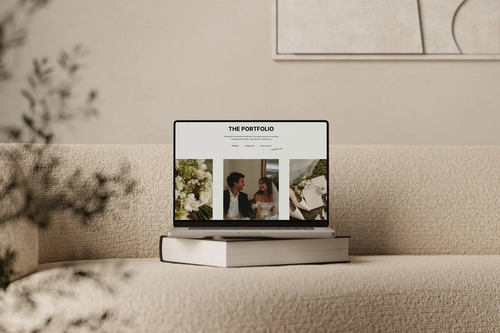
Step 4: Update your galleries and portfolio pages to match your photography style
For wedding photographers, the gallery and portfolio pages are where your brand comes through most clearly because your images are the main selling point. This is the second place to spend focused time.
1. Decide how to group your work
Look at how your template is set up. Common options include:
- One main portfolio page with highlight images.
- Separate galleries for:
- Weddings.
- Elopements.
- Engagements.
- Destinations.
You can usually keep the structure your template provides and just rename sections to fit what you offer. For example, if you mostly shoot elopements, you might change “Weddings” to “Elopements” and “Engagements” to “Adventure sessions”.
2. Curate each gallery with your brand in mind
Inside each gallery:
- Start with 30 to 80 images per full wedding gallery, depending on your style and template.
- Include:
- A mix of wide venue shots, portraits and details.
- Moments that show emotion, not only portraits looking at the camera.
When you choose images, think about:
- Consistency of editing.
- The type of couples and locations your ideal clients will connect with.
- The overall rhythm of the gallery, as someone scrolls.
You are not building a full client gallery. You are creating a highlight reel that shows the kind of experience and style couples can expect.
3. Tailor any supporting copy around the images
Many Showit templates include small bits of copy on gallery or portfolio pages, like:
- A short intro paragraph at the top.
- Captions for featured galleries.
- A simple CTA at the bottom.
Customize these to:
- Speak directly to the couples looking at the gallery.
- Emphasize what this type of work is like with you.
For example, if this is an elopement gallery, mention the feeling of the day, location type and what you help with.
You do not have to write long descriptions. Two or three sentences can be enough, as long as they sound like you.
Step 5: Rewrite key copy so the website sounds like your brand
Even a visually perfect template will not feel like your brand if the copy sounds like the demo or like every other photographer’s site.
You do not have to rewrite every word right now. Focus on the highest-impact areas first.
1. Prioritize these areas
Go through your site and update:
- Homepage hero headline and subheading
Already started in Step 3, refine now if needed.
- About page opening section
Share:
- Who you are.
- Where you are based.
- The type of weddings you photograph.
- One line about what you value in your work.
- Services / Investment page intro
Answer:
- Who your services are for.
- What couples can expect working with you.
- Any quick notes about process or experience.
- Contact page intro
A short, friendly line explaining what happens after they inquire.
- Button text and form labels
Swap out generic “Learn more” and “Submit” where it makes sense, so they feel more specific and inviting.
2. Use your natural voice
If writing is not your favorite, keep it simple:
- Write how you speak to couples in emails or at consults.
- Use short sentences and avoid overcomplicated wording.
- Keep “I” and “you” language, instead of talking about yourself in third person.
If you feel stuck on a section, imagine a couple sitting across from you at a cafe. What would you say out loud if they asked, “So what is it like to work with you?” or “What do you love photographing most?”
You can always polish later. For now, replacing generic demo copy with honest, clear words is the goal.
If you want to keep going later with search visibility once your words are in place, my guide to easy DIY SEO for Showit walks through that part of the process.
Step 6: Adjust layouts only where your content truly needs it
At this point, your site probably already looks and feels much closer to your brand. This is usually where perfectionism shows up and whispers “Maybe you should redesign everything.”
Not every section of a template will perfectly match your content, but that does not mean you need a full redesign.
In Showit you can move, resize and restyle almost anything, which is powerful. It also means it is easy to over-edit and end up with a messy layout that is harder to maintain.
Instead, make focused layout tweaks only where your content genuinely does not fit.
1. When to tweak a layout
Consider small adjustments when:
- A text box is too small and causes awkward line breaks.
- You need one fewer or one more image in a row and it looks unbalanced.
- You have an extra service or package that needs its own block.
- A section feels cramped and would benefit from more spacing.
Examples of light tweaks:
- Increase or decrease padding so sections breathe better.
- Adjust column widths so longer package descriptions fit.
- Duplicate an existing canvas if you need another similar section.
2. When to leave it alone
Try leaving the structure as-is when:
- You simply prefer a different visual style than the template’s, but it already works.
- A section is “nice to have” but not essential, and you do not have content for it yet.
- You are tempted to redesign a canvas “just because” rather than for a clear content reason.
If a section truly does not apply to your business yet, you can hide it from navigation and search rather than deleting. That way, if you want to add it back later, the layout is ready for you.
Keeping layout changes light helps your site stay cohesive and makes future updates easier, especially if you are not a designer and do not want to touch code.
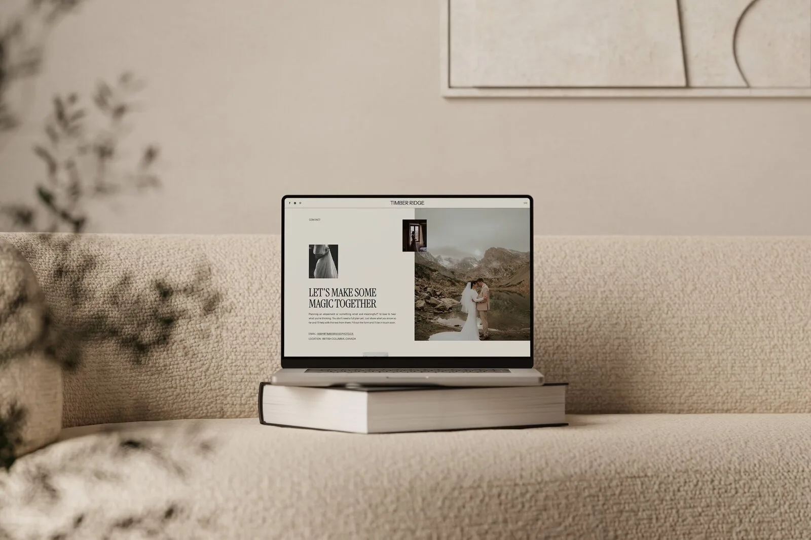
Step 7: Customize mobile views for an on-brand experience on phones
Showit treats mobile design separately from desktop, so you need to confirm that your brand colors, fonts and layouts look good on phones too.
This is an easy step to skip when you are on a laptop, but many couples will view your site on their phone first.
1. Switch to mobile view in Showit
Inside Showit:
- Click the mobile view icon so you can see the phone layout.
- Go canvas by canvas, starting with your homepage, then your most important pages (Portfolio, Services, About, Contact).
2. Check for these common issues
On each page, look for:
- Text overlapping or running off the screen.
- Images cropped in strange places, especially in full-width banners.
- Buttons that are too small to tap easily.
- Fonts that are too small to read comfortably.
- Colors that make text harder to read on a small screen.
Make simple fixes like:
- Increasing mobile font sizes slightly.
- Centering or stacking content that was side by side on desktop.
- Adjusting which area of an image shows on mobile, so faces and key details are visible.
- Adding extra spacing around buttons.
3. Keep the mobile experience focused
On smaller screens, less is more. If a section feels busy or confusing on mobile, consider:
- Hiding it on mobile if it is not essential right now.
- Simplifying the content so the most important information is easy to see.
Aim for a smooth scroll where a couple can:
- Understand who you are and what you do.
- See examples of your work.
- Find how to inquire, without hunting for it.
Keeping your Showit template cohesive across all pages
Once your main pages are customized, a quick pass across all canvases helps catch stray demo elements so nothing feels out of place.
Use this simple checklist as you click through your site:
- Colors
- Are you only using your chosen brand colors, neutrals and text colors?
- Are there any leftover template colors in icons, borders or backgrounds?
- Fonts
- Are headings and body text using the fonts you set in Design Settings?
- Are sizes and styles consistent, unless there is a clear reason not to be?
- Buttons and links
- Do buttons look the same across pages (shape, color, hover state)?
- Do they all lead somewhere intentional?
- Images
- Are there any remaining stock or template demo images?
- Do all photos feel consistent with your editing style and ideal client?
- Copy
- Any leftover lorem ipsum or template placeholder text?
- Any sections where the tone feels different from the rest of the site?
- Navigation
- Are the page names clear and consistent?
- Does your main menu match the path you want couples to take?
You can do this review in one short sitting. It is less about perfecting every detail and more about making sure nothing breaks the “this feels like one brand” experience.
If you like having a structured list to work through as you get ready to go live, you may also find my Showit launch checklist helpful at this stage.
When you might want extra help customizing your Showit template?
Most wedding photographers can get a brand-matched, professional site by following the steps above. Still, there are times when bringing in extra support makes sense.
You might want help when:
- You feel stuck rewriting your copy and cannot get it to sound right.
- You have outgrown your current brand visuals and need a full rebrand, not just a new site.
- You want to make deeper Showit edits and do not feel comfortable experimenting on your own.
- You have tried to customize your template before and ended up frustrated with the layout.
In those cases, working with a professional on your branding, copy or Showit customization can save you time and help you get the most from your template.
If you are comfortable DIY-ing but want a starting point designed specifically for wedding professionals, my Showit templates for wedding photographers are built with this process in mind, and support a range of wedding-focused businesses including photographers, elopement photographers, planners and content creators.
FAQ: Common questions about customizing a Showit template to match your brand
Can I customize a Showit template for a niche wedding business without code?
Yes. Showit templates can be customized using the visual builder, so you do not need to write code to adapt them for more niche wedding industries.
You can:
- Change page names, copy and images to fit elopements, wedding planning, or content creation.
- Adjust services sections to match how you work.
- Use the same structure but speak directly to your specific clients.
The key is still the same brand-first process: colors, fonts, images, copy, then layout tweaks and mobile.
Do I need professional brand photos before I customize my template?
You do not need professional brand photos to get started. You can launch with a mix of:
- Strong client work.
- Simple, cohesive personal or behind-the-scenes images.
What matters most is that your images feel consistent and support the experience you want couples to expect. As you grow, adding intentional brand photos of you working, your process or your studio can absolutely improve your results, but they are not a requirement to begin.
Can I combine sections from different Showit templates?
It is possible in Showit to combine or copy canvases and sections from different templates. Many photographers like to do this so they can mix a favorite homepage from one template with a portfolio layout from another.
However, combining sections from different templates can increase complexity if you are not careful, because:
- Styles may not match out of the box.
- It can be easier to break consistency in fonts, colors and spacing.
If you choose to combine, keep your brand-first rules in place:
- Reapply your Design Settings.
- Check each imported section against your overall style.
- Keep a close eye on mobile layouts.
If this feels like too much, sticking to one well-chosen template is usually simpler and still very customizable.
How do I know when my template is “customized enough” to launch?
Your site is customized enough to launch when:
- Your main pages are in place and connected:
- Homepage.
- Portfolio / Galleries.
- Services / Investment.
- About.
- Contact.
- Brand colors and fonts are set in Design Settings and used consistently.
- Demo images and lorem ipsum have been replaced on those key pages.
- The copy on high-impact sections sounds like you, even if it is not perfect.
- You can clearly see the path a couple should take to inquire.
You do not need every future page, blog post or extra feature live before you share your site. Think of launch as the start of your website’s life, not the end of the project. You can refine sections, add galleries and improve copy over time.
If you like a detailed, step-by-step approach, my step-by-step guide to launching your Showit website template can help you move from “almost ready” to live.
When you are ready to start (or restart) with a template designed for the wedding industry and friendly to this kind of DIY customization, you can shop Showit Templates.
DOWNLOAD A FREEBIE
How to Launch a Showit Website Start to Finish
Looking to launch your dream website, but feeling overwhelmed with where to start? From purchasing your domain to publishing your site, this checklist will guide you through each step so you can launch your website with ease.