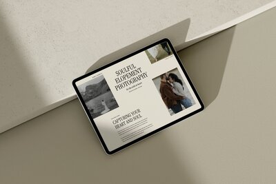
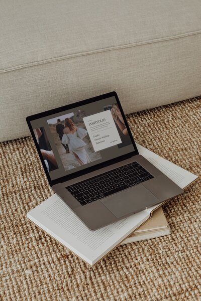
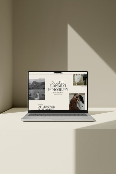
The most common mistakes choosing Showit templates happen when you pick for pretty demo styling instead of structure, portfolio fit, words, and launch capacity. Before you buy, check how your real galleries, services, client journey, SEO basics, mobile layout and timeline will work inside that template, not just how the demo site looks.
*Affiliate disclosure: This post contains affiliate links, which means that we may receive compensation if you make a purchase using these links.*
Choosing a template only because the demo looks pretty is the fastest way to feel stuck later. When you are comparing Showit templates as a wedding photographer, you are not just shopping for a new outfit for your brand. You are choosing the container for your galleries, your services, your client journey and your content.
Below are the most common mistakes photographers make when choosing Showit templates, and how to avoid each one before you buy.
1. Choosing the prettiest demo instead of the best structure
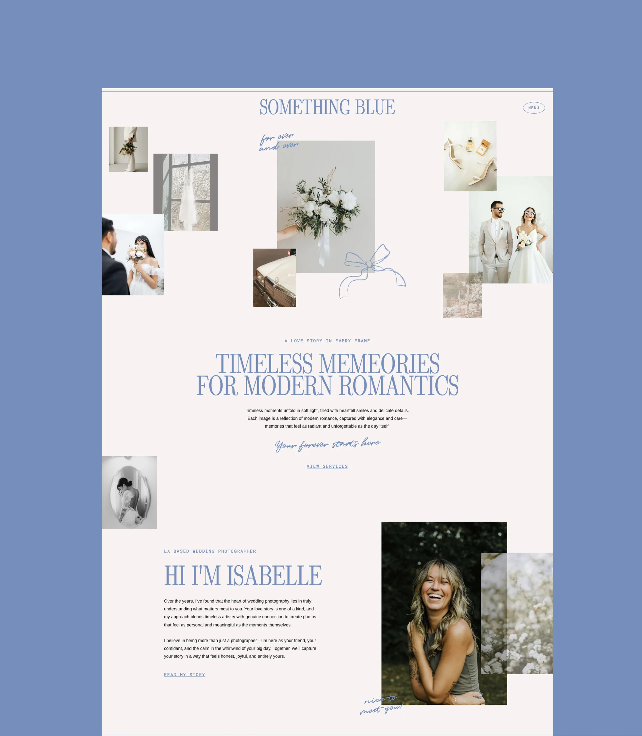
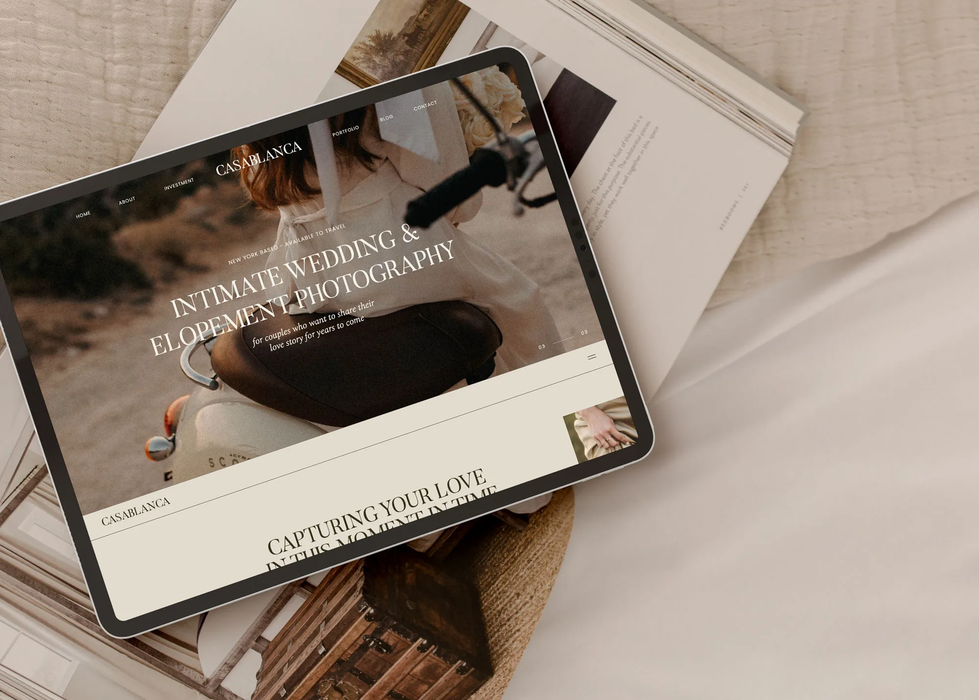
It is easy to fall in love with the template that looks the most like your Pinterest board. Light, airy fonts, creamy backgrounds, cinematic hero images. That matters, but for wedding photographers the bigger decision is structure.
A wedding photographer needs strong portfolio presentation, emotional trust and a clear path to inquire. How a template handles those things will matter far more than the exact fonts or colors you see in the demo.
When you look at a demo site, ignore the colors for a moment and look at:
- The order of pages in the menu. Is there a clear Home, Portfolio or Galleries, Experience or Services, About and Contact, or is it built for a different type of business altogether?
- The order of sections on the home page. Do you see a hero, a short intro, featured galleries or images, a simple explanation of services and process, social proof and an easy path to contact?
- How many places you can show your work. Having different options for how to display photos is a big one. If the whole home page is a single full-screen slideshow, you will not have much room to guide couples or explain what you do.
- The balance of photos and copy. The right balance of photo and copy is more effective than just large or many photos everywhere. You want your images to stop the scroll, and your words to explain who you are, what you shoot and what happens next.
A demo built for planners or designers might give most of the space to text and leave small image blocks. A demo built for educators might push you to a big “course” or “shop” section you do not need at all. As a wedding photographer, judge templates through the lens of how couples decide to inquire with you, not how another type of business would sell.
2. Ignoring how your real galleries fit the layout
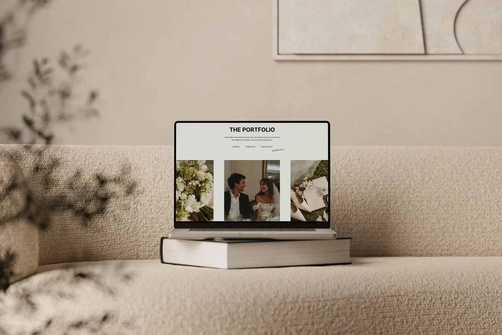
The images in a demo are hand-picked for that layout. Your galleries are real weddings, real elopements, real sessions, with their own mix of orientations and crops. One of the biggest mistakes choosing Showit templates is assuming your photos will drop into any layout and look the same as the demo.
Some templates only show a small highlight grid and never link to full galleries. That might work for you, or you might want couples to be able to click deeper into a full wedding day story. Decide which is more important for your sales process, then favour templates that already support it.
3. Not telling your website readers what to do next
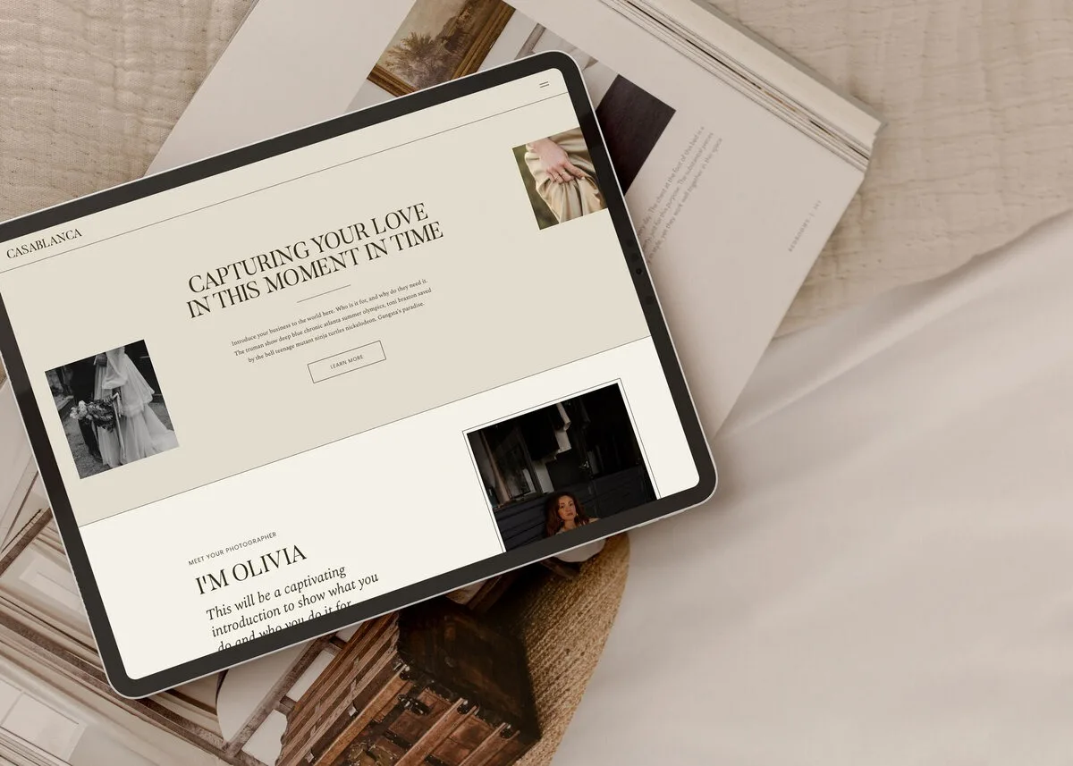
A photography website is not just a portfolio. It is a tool that moves an interested couple from noticing your work to trusting you enough to send an inquiry.
When you look at a website template, trace that path.
- How does a couple arrive? From a search result, Instagram, a vendor referral, a friend’s link. Does the template make a strong first impression on the home page or relevant landing page?
- What is the next obvious click? Do they see an easy way to view your weddings or elopements? Is “Portfolio” or “Galleries” clearly labeled, or are they lost in clever menu names?
- Once they click into your work, is there context? Do gallery pages have room for short intros (location, couple names, what made the day unique), or are they just image walls?
- Where do they learn about working with you? The template should include clear space for an Experience or Services page that outlines what you offer, where you work and what your process looks like.
- How often are they invited to contact you? Calls to action should appear on the home page, portfolio pages, about page and services page, not only on a single contact page.
A good template lets you place clear copy and calls to action so visitors can understand your offer and know what to do next. You should be able to tell, just by clicking through the demo, whether a couple would always know “what now?” on each page.
If you already have a sense of your process, look for sections that support it. For example:
- A simple “3 steps to working together” on the home or experience page
- Room for starting prices or investment cues, if you plan to share those
- A section for testimonials or kind words from past couples
That structure will do as much to increase inquiries as any font or color choice.
4. Treating mobile as a quick final check
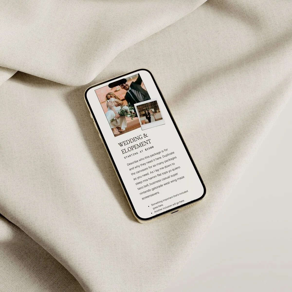
Many wedding inquiries start on a phone. Guests are on the couch, couples are together scrolling venues and vendors, planners are pulling up sites quickly. Mobile cannot be a final glance after launch. It needs to influence your template choice.
When you preview a Showit template demo, spend as much time on mobile as you do on desktop. Pay attention to:
- How hero images crop on small screens
- Whether galleries still feel immersive when stacked vertically
- How quickly a visitor reaches a button or inquiry form without endless scrolling
Showit allows separate desktop and mobile views, and that can require separate attention after customization. If the mobile layout already feels cramped or confusing in the demo, expect to spend more time editing it later.
On mobile, test:
- Readability of headings and body text
- Tap size and visibility of inquiry buttons
- Any overlapping elements that might be hard to tap or read on a small screen
A template that feels clean and direct on mobile will be easier to launch and will better support couples who are viewing you on the go.
If you want extra support for this part, you can use a resource like the Showit launch checklist to remind you to review mobile thoroughly before you go live.

5. Assuming every template is equally SEO-ready
“SEO-ready” gets used a lot in template descriptions, but at the template-choice stage it has a very specific meaning. It does not mean the template can guarantee search results. It means the layout makes search-friendly setup possible once you do the work.
Basic SEO on a photography site includes:
- Page titles and meta descriptions
- Headings
- Text that naturally includes your location and type of work
- Image treatment, for example file names and alt text
Showit’s own SEO guidance uses photographer-relevant keyword examples, including the phrase “photography website templates”, to show how content and keywords connect for small businesses. It also notes that small businesses can benefit from lower-volume, closely matched keywords rather than trying to compete on the broadest phrases available. You can read more about this in their keyword and content research guidance.
From a template perspective, here is what to watch for:
- Clear page structures that allow for headings and text sections, not only images
- Space on each main page for at least a short paragraph or two of copy
- Blog layouts that support headings and text for each post
- Avoiding designs where text is baked into images, so you can actually write indexable content
HTTP Archive’s Web Almanac found in 2019 that “10.67% of pages have no heading tags at all.” That is a reminder that heading structure is often missed. When you preview a template, make sure there is an obvious place for at least one clear H1 and supporting headings on each page.
No template will do keyword research or write content for you. Your job is to pick a design that does not fight you when you are ready to add those page titles, headings and words.

6. Buying a layout your text cannot support
You may have heard two different pieces of advice:
- One view says you do not need to write final copy before buying a template.
- Another view emphasizes clarifying your messaging and writing brand-aligned copy before you invest.
There is truth in both.
You do not need every word written before you choose a template. You can absolutely start from a strong, photography-focused layout and then refine your text as you customize. However, buying a very text-heavy template when you have no idea what you want to say will slow you down.
A balanced approach looks like this:
- Before you buy, get clear on the basics:
- Who you serve (for example, local wedding couples, destination elopement photographers, planners or content creators if you have an educational angle)
- What you want to be known for (style, locations, types of days)
- The main services you want to offer
- Then, as you compare templates, ask:
- Does this layout give me natural places to say those things?
- Are there sections I would never use because they do not fit my business?
- Would I need to write long-form copy I do not plan to write, just to make the page feel complete?
Template structure can help guide the copy process instead of forcing a strict copy-first workflow. You can see how many sections you need to fill, what kind of headlines go where, and what level of detail is realistic for each page.
If you want a sense of common pre-purchase copy questions from other Showit users, you can read through the considerations in the Showit template pre-purchase questions. Use them to sanity-check that your chosen layout matches how much you want to write.
7. Not leaving enough time for the final website setup
Finishing the design does not mean your website is ready to launch. Leave enough time to complete the final connections and test that everything works properly.
- Contact forms. Connect your forms to an email address you regularly monitor, then submit a test inquiry.
- Email marketing. Connect newsletter and freebie forms to a platform such as Flodesk. Confirm that subscribers enter the correct segment and receive the intended emails.
- Privacy policy. Add a privacy policy explaining how your website collects and uses personal information. This may be legally required when using forms, analytics, cookies or email sign-ups.
- Custom domain. Connect your domain to your Showit website. Showit customer support can guide you through the process if needed.
I sell Showit website Templates for the wedding industry, with a focus on making a professional, modern site feel achievable and fast. For extra guidance beyond the template itself, you can read my step-by-step guide on how to launch your Showit website template.
Be honest about your own launch capacity:
- How much time you can realistically spend each week
- Whether you are comfortable inside Showit or this is your first time
- Whether you have images and copy ready, or you are creating everything from scratch
Choosing a template with clear instructions and realistic page count for your capacity will help you launch faster and feel better supported.
Quick pre-purchase checklist for photographers
Use this as a comparison tool when you have two or three Showit templates open in different tabs. For each one, walk through the checks and look for green flags.
| Check before buying | Why it matters | Green flag |
|---|---|---|
| Portfolio fit | Your real galleries need to sit well in the layout to show your best work. | The mix of vertical / horizontal images, collages and full galleries fits your shooting style and volume. |
| Page structure | The order of pages and sections should match how couples decide to inquire. | Clear Home, Portfolio, Experience / Services, About and Contact with intuitive section flow. |
| Copy room | You need enough space to explain what you do without being forced to write a novel. | Each main page has room for short, clear copy blocks plus headings, not just images or long walls of text. |
| Mobile preview | Many visitors will view your site on phones first. | Mobile demo is clean, readable and keeps CTAs visible without endless scrolling. |
| SEO basics | The layout must let you add headings, text and image alt text later. | Each page has obvious places for H1s and supporting text, and the blog layout supports headings and body copy. |
| Customization flexibility | You want room to make the design feel like your own brand. | Neutral layouts and multiple section types that still look cohesive when colors and fonts change. |
| Support | Good support and resources make launch faster and less stressful. | Seller offers support, clear policies and a launch checklist or similar resource. |
You can reuse this table every time you look at a new template to keep your decision grounded in your actual business needs, not just demo styling.
Shop Showit templates with a clearer checklist
Now that you know what to check, you can browse Showit designs with a much sharper eye. Look at structure before style, your real galleries before demo images and your capacity before page count. Vanilla and Oak sells Showit website Templates and Canva templates for the wedding industry, for Wedding Photographer brands, elopement photographers, Wedding planners and Wedding content creators who want a professional, modern site, and fast. You can explore designs built specifically for this world when you shop Showit templates for wedding photographers.
FAQs
Should I write my website text before I buy a Showit template?
You do not need fully finished copy before you buy a template, but you do need clarity on your core message. Know who you serve, what you offer and what makes your work distinct, then choose a layout that gives you natural spaces to say those things. This avoids buying a very text-heavy design when you only plan to write short, simple copy.
What should I do before buying a Showit template?
Before buying, audit your portfolio (image orientations, volume, hero options), sketch your main pages and sections, decide your basic services and check your timeline and capacity for launch. Then, preview each template on desktop and mobile, read the seller’s support and template policies and confirm there is a launch checklist or similar resource to guide you.
How do I choose the right Showit template for my photography business?
Start with your business model and client journey, not colors. For a wedding photography business, look for strong ways to display galleries, clear Experience and About pages, an easy path to inquire and enough flexibility to fit your brand without a rebuild. Use the checklist above to compare portfolio fit, page structure, copy room, mobile layout, SEO basics, customization and support for each template you consider.
What happens after I buy a Showit template?
After purchase, you receive what you need to add the template to your Showit account, then you customize the pages with your own images, words and branding before connecting your domain and launching. Support and any included launch resources from the template seller will guide you through the steps so you do not miss important details like forms, buttons and mobile adjustments.
When you are ready to put this into practice and choose a design that fits your work, your words and your launch timeline, you can use everything in this guide as a filter while you Shop Showit Templates.
DOWNLOAD A FREEBIE
How to Launch a Showit Website Start to Finish
Looking to launch your dream website, but feeling overwhelmed with where to start? From purchasing your domain to publishing your site, this checklist will guide you through each step so you can launch your website with ease.