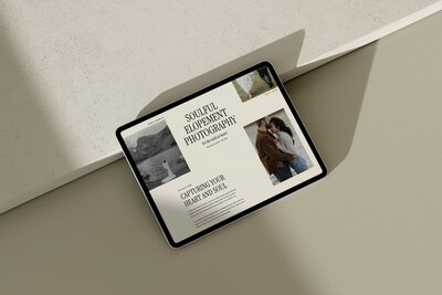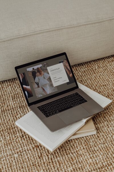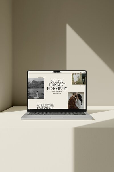

Summary: The right website template should already feel close to your brand, support your galleries and blog, and make it simple for couples to inquire on mobile. Use this Showit template shop checklist to compare templates and shops before you buy, then again before you launch, so you do not end up wrestling a “pretty” site that does not actually book weddings.
Choosing the right website design for your photography business is not a small decision. One design looks stunning, another looks “fine,” and you are left wondering which one will actually help you book more clients. This Showit template shop checklist is the one I use when designing and reviewing website templates for wedding professionals. Keep it beside you while you browse so you can make a clear, confident choice before you click buy.
Website template checklist for wedding photographers
Check off these points before buying your wedding photography website template:
- Brand and niche fit feels close to your style, not the opposite of it
- The template includes core pages (home, about, services, portfolio, contact, blog)
- Galleries support your work and image mix without overloading pages
- Mobile layout, navigation and inquiry path feel simple on a phone
- Blog and SEO basics are supported with clear headings and real copy areas
- Shop offers clear resources, policies and support for a DIY launch
- Your top 2 or 3 templates score well side by side on these categories
- You have run a quick pre-launch review before you publish
1: Does this website template match your brand and wedding niche?
Start by choosing a template that already leans toward your style and wedding niche so you are refining, not fighting, the design.
If you are an elopement or adventure photographer, you might look for layouts with:
- Big, full-bleed images that feel immersive
- Earthy colors, texture and white space
- Space for location-focused copy and travel details
If you shoot luxury or editorial weddings, you might prioritize:
- Clean typography and minimal layouts
- More white or negative space
- Smaller, curated image groupings that feel like a magazine spread
Retro film, documentary, romantic, heirloom, city-chic, vineyard weddings, coastal events, ballroom nights, backyard celebrations, you name it. Each vibe is easier to convey if the template is already in the same universe.
As you scroll:
- Read the headings and microcopy the template uses. Does the tone feel close to how you write, or would you have to rewrite every single section to sound like yourself?
- Look at how the portfolio images are cropped. Do they flatter your style of shooting (wide landscapes, tight portraits, film borders, black and white)?
- Notice the overall mood. Light and airy, dark and moody, warm and nostalgic, neutral and editorial. A template that starts where you want to be will always be easier to customize.
If you feel yourself saying “I could make this work… with a lot of changes,” treat that as a red flag. Keep looking for a design that makes you think “this is almost me” instead.
2: Are the pages and layouts you need already built in?
Before you fall in love with the home page, check that the template actually includes the pages and layouts you need as a wedding photographer.
At minimum, you will usually want:
- Home page
This introduces your brand and guides people to the next best step. Look for a clear hero area, short copy sections and paths to your main services, portfolio and contact.
- About page
Couples hire a person, not just photos. Make sure there is room for your story, values and a photo of you, plus a way back to services or portfolio.
- Services or pricing page
Whether you show full pricing or just starting rates, you need a place to explain what you offer and who each package is for. Check that the template includes space for 2 to 4 collections, add-ons and FAQs.
- Portfolio or galleries page
This is where your work needs to shine. Confirm that the template has a main portfolio hub and individual gallery layouts you like, not just one generic grid.
- Contact page
Your inquiry form should be easy to find and quick to fill in. Look for a simple, uncluttered layout with a form that includes the fields you care about (names, date, venue, budget range, etc.) and clear expectations on response time.
- Blog (index and single post template)
A blog helps you showcase real weddings, venues and tips. Make sure there is a main blog page and an individual post layout you can imagine using for full galleries and wedding stories.
Also check for any niche-specific layouts you need, such as:
- A separate elopement page and full wedding page
- A page for destination or travel details
- A page for education, print products or mentoring
- A gallery layout that suits multi-day events or Indian weddings
If a template is missing one of your must-have pages, ask yourself if you are comfortable building that from scratch or if you would rather choose a template where it already exists.
3: Portfolio and image needs for wedding photographers
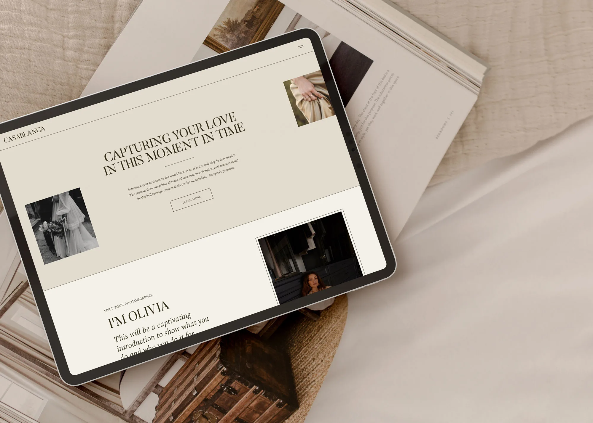
Your portfolio is the core of your site, so treat the gallery and image structure as a deal-breaker, not a “nice to have.”
Look at:
- How many gallery layouts there are
Is there only one portfolio page, or multiple styles (grids, collage, sliders, full-screen) you can use for different venues and services?
- How many galleries are built in
Count how many separate galleries you can see: full weddings, elopements, engagement sessions, editorials. If you shoot in several cities or venues, a single “portfolio” page with three thumbnails might not be enough.
- Image spots on the homepage
Scroll the whole homepage and note how many spots are set up for photos: hero image, featured galleries, testimonials with images, gallery previews, blog previews. You want enough space to show variety without turning your homepage into a giant collage.
- Flexibility to add more
In the template preview or demo, look for how sections are built. If you wanted to duplicate a full wedding gallery block or add another featured wedding to the homepage, does the structure make sense?
Performance matters too. Showit explains that 100 unoptimized images (around 2MB each) means a user has to load 200MB of data, which is a lot for couples on mobile or slower connections. Even though you are a photographer, more images are not always better if the site slows to a crawl.
When you compare templates:
- Prefer designs that use fewer, larger, intentional images on the homepage rather than endless small ones.
- Check that blog post layouts support a thoughtful number of images per story. You want to tell the full wedding story, but not so many files that each post becomes heavy.
- Make sure the galleries look good with both horizontal and vertical images, especially if you shoot a mix of both.
If you already know your average gallery size or how many weddings you want to feature, imagine how they would actually live inside that template. If you feel boxed in, keep looking.
4: Mobile layout, navigation and inquiry path
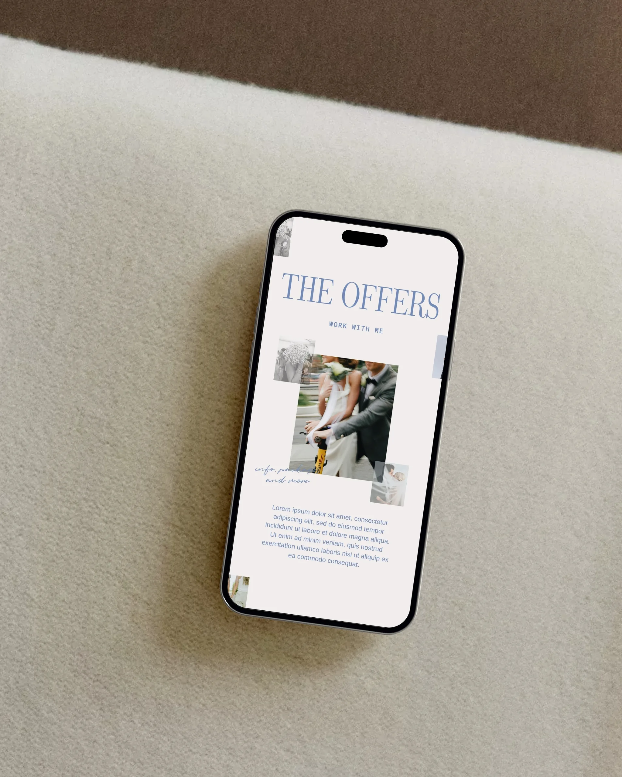
Most couples will land on your site on their phone first, so always check the mobile preview of a template before you buy.
On mobile, pay attention to:
- Hero section
Can you clearly read your name, location and what you do on a small screen? Is the main call-to-action button visible without scrolling much?
- Menus and navigation
Tap the mobile menu on the demo. Are the menu items easy to tap, or tiny and close together? Is “Contact” or “Inquire” visible without digging through nested menus?
- Buttons and links
Look at buttons throughout the site. Are they large enough to tap with a thumb? Do they stand out against the background?
- Galleries on mobile
Swipe through a gallery or scroll the portfolio page demo. Are images cropped awkwardly, or do they resize nicely? Are sliders easy to control on a touch screen?
Then check the full path from landing on the homepage to sending an inquiry:
- Homepage: Is there a clear next step like “View weddings,” “See services,” or “Inquire”?
- Services / portfolio: From here, can a couple quickly decide you are a fit and spot a button to reach your contact page?
- Contact page: Is the form straightforward on mobile, with easy-to-tap fields and no endless scrolling?
If any of those steps feel confusing or clunky on a phone in the demo, they will feel even worse once you add your real copy and images. A good template shop will have paid attention to the mobile experience, not just the desktop wow factor.
5: SEO, blogging and content flexibility
A pretty site that no one finds will not help your bookings, so look for templates that support blogging and basic search visibility over time.
For blogging, check that the template includes:
- A blog home page
This is the page that lists all your posts. Look for clear categories or tags, featured posts and enough room for good titles and short excerpts.
- A single post template
Make sure individual blog posts have space for an intro, lots of images, headings and a clear way to link to your contact page or services.
- Room for real wedding storytelling
If you like sharing vendor credits, timelines and tips, pick a layout that is not only stacked photos. You want space for paragraphs and headings too.
On the SEO side, even as a DIY user, you want a template that:
- Has clear heading structure (a main heading, then subheadings) on key pages
- Gives you text areas for location- and niche-specific phrases, not just images everywhere
- Allows meta titles and descriptions via Showit’s built-in settings
You can always go deeper later, but a template that allows you to add thoughtful copy and blog posts will serve you better for long-term visibility and for showcasing real weddings.
If you want extra help on this, I break down simple, photographer-friendly ideas in my guide on easy DIY SEO tips for Showit.
6: Support, policies and how DIY-friendly the shop really is
Two templates can look similar, but the shop behind them can feel very different once you start customizing.
When you compare Showit template shops, look for:
- Clear setup or onboarding resources
Do they offer a written setup guide, tutorial videos or a step-by-step walkthrough for connecting your blog and domain? A shop that provides setup instructions will make your DIY process much smoother.
- A launch checklist or roadmap
You do not want to guess what to do after you hit “Add to library.” A clear launch checklist means you can follow the steps without feeling lost. You can also use my Showit launch checklist if you need an extra layer of support.
- Support boundaries
Check what kind of help is included. Some shops offer limited email support or troubleshooting help, others focus on self-serve resources. Decide what you are comfortable with and what you might need.
- Template policies
Before you buy, skim the shop’s template policies so you know about refunds, usage rights and how many sites you can use the design on.
- Real-life examples
A shop that shows live sites built from their templates or has detailed template showcases gives you a better sense of how flexible the designs are.
If you are planning a full DIY build, choose a shop that speaks directly to photographers and offers resources tailored to the way you work.
7: Comparing similar templates side by side
Once you have 2 or 3 favorites, use a simple comparison system so you do not get stuck in indecision.
Create a quick table or note in your phone with columns for each template and rows for:
- Brand and niche fit
- Required pages and layouts
- Portfolio and gallery support
- Mobile experience and inquiry path
- Blog and SEO-friendly structure
- Support and DIY-friendliness
Give each category a simple score, like 1 to 5, or just jot notes like “perfect,” “fine,” or “missing key page.” When you see it all side by side, one template usually starts to stand out.
If you photograph different types of work (like weddings and elopements, or weddings and education), give extra weight to the categories that matter most for your next booking goals. For example, if you are trying to book more full wedding weekends, prioritize the template with the strongest gallery and services layouts.
If you want a starting point with minimal, editorial designs built for photographers, you can browse all Showit templates I have created for the wedding industry.
8: Pre-launch checks once you’ve customized your template
Before you publish, run through a quick pre-launch review so your template works as well as it looks.
Use this as a final checklist:
- Preview desktop and mobile
In Showit, toggle between desktop and mobile for every main page. Look for weird crops, overlapping text or buttons that feel off-center.
- Test navigation
Click every menu item and footer link. Make sure nothing is broken and every important page is easy to reach in two or three clicks.
- Walk the full inquiry path
Pretend you are a couple who found you through search or social media. Land on the homepage, skim, view a wedding, read your services, then fill out the contact form. Fix any step that feels confusing.
- Check text for clarity
Skim your headings and buttons. Are they clear and action-focused, or vague and fluffy? Couples should always know what is next.
- Review images and performance
Confirm you are not overloading any single page with more images than it needs, especially your homepage and long blogs. For blog images, Showit recommends a “Suggested Size – 2400px (height & width)”, which can help you prepare your files before uploading.
If you want a more detailed, step-by-step process from “template in my library” to “site is live,” I walk through the full flow in my Showit website launch step-by-step guide.
FAQ: quick answers about choosing a website template shop as a wedding photographer
How do I know if a website template is customizable enough for my brand?
Choose a template where you love the structure, not just the fonts and colors. If you can imagine your photos and words in those layouts with only small tweaks, it is customizable enough. Showit gives you control over fonts, colors and layout spacing, so focus on whether the underlying sections fit the way you work and sell.
How many images should I plan for key pages like the homepage and portfolio?
Plan for enough images to tell the story, not every image from the gallery. Your homepage might use a handful of strong, varied photos, while your portfolio and blog can hold more. Keep performance in mind so you are not loading dozens of huge files on one page, especially for couples browsing on mobile.
Should I customize desktop or mobile first in Showit?
Customize desktop first, then refine mobile. Showit treats them as linked but separate, so it is usually faster to design your main layout on desktop, then adjust size, spacing and stacking for mobile afterward. Always finish with a full mobile review so the phone experience feels just as intentional.
Can I use AI-generated images on my Showit site as a wedding photographer?
Use AI images with care and intention. They can work for background textures or abstract visuals, but for portfolios and galleries, real client work is what builds trust. Couples want to see actual weddings you have photographed, so keep your core imagery authentic to you.
Next steps: apply the checklist and choose your website template
Keep this Showit template shop checklist open while you compare demos so you are rating each option on how well it serves your bookings, not just how pretty it looks. When you are ready to pick a design built for photographers and the wedding industry, you can shop Showit templates and choose the one that feels closest to your brand and goals.
DOWNLOAD A FREEBIE
How to Launch a Showit Website Start to Finish
Looking to launch your dream website, but feeling overwhelmed with where to start? From purchasing your domain to publishing your site, this checklist will guide you through each step so you can launch your website with ease.