BROWSE BY CATEGORY:
My mission is to make it easier and more accessible for photographers to launch a website they're obsessed with through Showit website templates and custom design services,
I'm Chanel

Lifestyle
Business
Showit
Website Tips
Welcome to the Blog
Creating colour palettes is probably one of the most exciting parts of my job. Who doesn’t love mixing and matching beautiful shades and tones to tell your story?
But there is a method to the madness. Here is my step by step process in creating a cohesive colour palette for your brand:
Make a Moodboard
Start by curating a board on Pinterest of images that catch your attention or evoke an emotion that you want your brand to give off.
And remember – images don’t have to have any direct relation to your business.
Your inspiration board can be full of anything from a cozy sweater to a draw dropping mountain landscape. A beautiful fragrance package to drool worthy styled pieces of food.
Once your moodboard is done, you should get an overall sense of the tone of what your colour palette is going to look like
Colour Psychology
Now that you have a basic idea of what colour direction you will be taking your brand, think about how it relates psychologically to your ideal target audience.
If you’re to give off feelings of warmth and happiness – using a dark blue probably isn’t the best way to go.
Canva has a great introduction to colour psychology which you can take a look at here:
https://www.canva.com/colors/color-meanings/
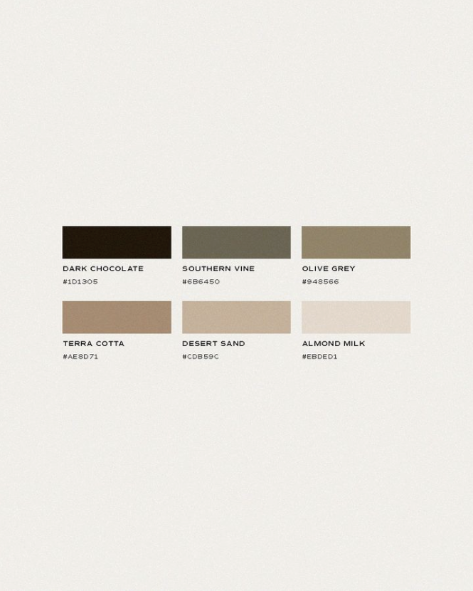
Four Elements of Colour Hierarchy
To create a consistent colour hierarchy in your brand, you need a minimum of at least one of each of the following four elements:
Light – to use as neutral backgrounds, or text over darker images and sections of a website
Dark – to be used opposite of your light colour – ie over lighter images and for sections of a website
Mid Range – they need to be versatile enough that they and not clash or compete with each other, and round out your palette. Can also be used as backgrounds
Accent – this is the colour in your palette to make things “pop”. You want to use a colour that gives visual interest, yet still works cohesively with the rest of your palette. Note – your “pop” will be relative to your brand strategy, and overall vibe. This doesn’t mean that your pop has to be neon or super bright.
Test Your Palette
Okay so you’ve got a bunch of beautiful little circles in a row making up your new colour palette…
But do they actually work together?
Test, test, and I cannot stress this enough, test again your colour palette!
One of the biggest mistakes I made early on in my design career was not testing colours together within the brand elements to see how they work.
If you don’t have your brand design elements yet, layer the colours on top of each other and keep an eye out for any “clash” or “stress” between the colours.
Tweak Your Palette
After testing, you might have come across a colour or two in your palette that are just too similar, or give off a feeling of clash.
This is where you’ll want to tweak your palette before finalizing it.
Sometimes it’s just adjusting the colour by a shade or two, or sometimes this is going back to step one, and pulling a new colour out of your moodboard to test and tweak again.
One of my favourite tools to find new shades is coolors.co. They have a easy shade picker so you can test and tweak until you nail your colour palette, right down to the last hex code.
And there you have it! Happy colour palette creating!
Helping photographers hit publish on a website that doesn't only look good, but works just as hard as you do.
Look Around
Connect
Subscribe
Get the latest studio updates, and web design tips, tricks and inspo straight to your inbox.
JOIN THE LIST
© 2024 VANILLA + OAK


